Kid’s rooms and nurseries are high on my list of favorite spaces to design and while Clover has had a few rooms we quickly cobbled together in all the moving around we did her first year of life, this one is going to be around for a while. It is a space I genuinely want to spend time in so I happily tell her “one more story” 52 times every night and nap time (ok sometimes after #52 I might be ready to pull my hair out but you know what I mean. The first 50 is bliss. ha).
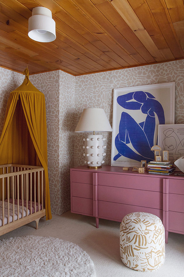


Clover is our little budding artist, when I started designing the space is when she first discovered drawing “aka scribbling” and I would often find her drawing away, filling pages with her doodles, it would occupy her for hours a day. So I wanted her room to be inspired by art and in turn inspire her as she gets older. Matisse has long been a favorite of mine and when I found the wallpaper I was thrilled, however the colors it came in wasn’t exactly what I was looking for. Luckily Kate was up to creating a custom color for me and a few samples later I had the perfect Matisse inspired paper which became the backdrop for the room.
More often than not even in my own spaces, I will put together a quick design board to see how some of my selects look alongside each other. I often go about designing a room as I would painting a canvas. Choosing colors and composition of the colors within the space. In this case it meant doing a lot of custom colors. Much like the wallpaper… the dresser I found on Lulu & Georgia and fell hard in love with it. It is a dresser I will keep forever but it only came in white. I wanted to bring some more saturated tones into her room so I painted it. You will notice I ended up going even more saturated than I had planned on the board. Once I had the wallpaper in hand, IRL, I selected the dresser color from there. It is called “Audrey’s Blush” by Sherwin Williams. At the time we were still knee deep in moving boxes and I couldn’t find our paint sprayer so I had the Sherwin Williams store create a custom spray can with their Audrey’s Blush color. They had me buy a quart of an oil based paint and then they created the spray can from that paint. I’ve done this at specialty paint stores in LA as well.
Another piece in the room I changed colors from the design board is the Jenny Pennywood fabric I used to re-upholster a vintage ottoman. Jenny Pennywood now sells fabric by the yard and when I received the samples I was drawn to the “fold” fabric design but it wasn’t shown in the gold color so I asked if she could do the “fold” in gold and voila. Another perfect customized piece in the space. I guess my point is don’t settle on your vision and don’t be afraid to customize.
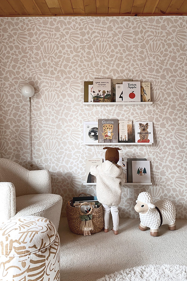

The original wood ceiling was the only thing we kept in the room and much like the rest of the house, I wanted to highlight it by keeping the rest of the room light in color. Even though the palette is predominately whites and ivories it still feels warm and cozy because of the wood ceiling, the soft carpet, the textured chair and the visual texture of the wallpaper pattern. The cherry on top of the cozy factor is the floor to ceiling drapery. There is nearly one full wall of glass in the room with a large sliding door. I chose the Ivory Linen Ripple Fold Drapery from The Shade Store and had it lined with a blackout liner. You can’t see from these photos but the track is mounted on the ceiling just like in our master bedroom. The Shade Store did the installation here as well.
Even though the room is small I played with scale with the large dresser, an extra large print and the oversized lamp. The canopy, the floor to ceiling draper,y and the shelves on the opposite side of the room balance out the space.
Hope you enjoyed the tour!
Georgia // Crib by Kalon // Matisse print poster // Line Drawing Art by Wit & Delight // Wall Sconce by Human Home // Wallpaper (custom color) by Kate Zaremba // Lamp by Kelly Wearstler // Ceiling Fixture by Cedar & Moss // Mustard Muslin Canopy // Vintage Ottoman upholstered in Jenny Pennywood Fold Fabric in Gold // Floating Shelves as book ledges from Target // Farm Hopper Sheep // Hanging Swan by Tamar Mogendorff // Round Rug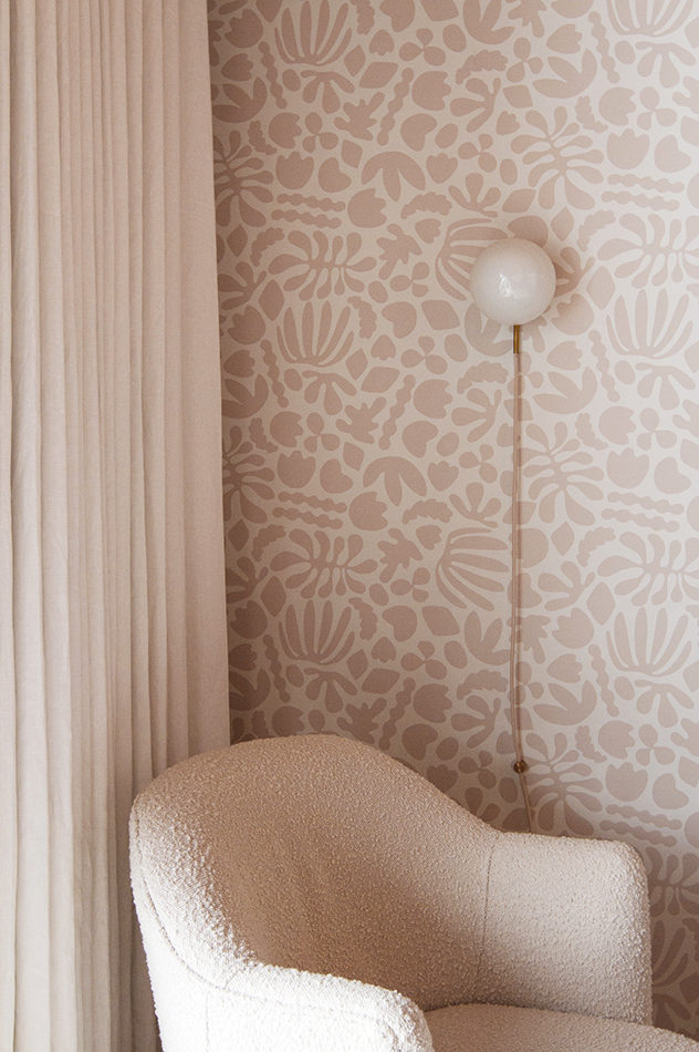


Very lovely interior colours you have there. Great ideas for me for Avenue South Residence . Thanks so much for sharing.
Beautiful!! Can you tell us about the carpet? I am thinking about doing carpet in a room and would love to hear what type/brand you used!
The color combination is fantastic! I really love that you’re not afraid of color but at the same time it‘s never loud and overwhelming! You did such a great job!
So inspiring, also planning my daughters room
and having a very hard time choosing which carpet would work well!
So good! And what type of did you use?
wow! A very beautiful wallpaper color!
Would love the deets on this carpet as well. Beautiful room!
[…] Found it on Etsy, Remember this marble sink from my soho project? Found it on etsy, remember the canopy in clover’s room? Yes Etsy. You get the […]
[…] how to make the objects in a space punchy but not compete with the rest of the room). I love the nursery she did for her daughter, Clover. I also tend to check in with Emily Henderson’s blog on general design questions I have, like […]
I really lovE your crib sheet and quilt – where are they from?
hi rosie, they are from parachute
I know this post is a few years old but i love the carpet! Could you share details on it? Thank you!
hi emily, here is a the link https://www.maslandcarpets.com/collections/carpet/products/masland-carpets-in-beachfront#