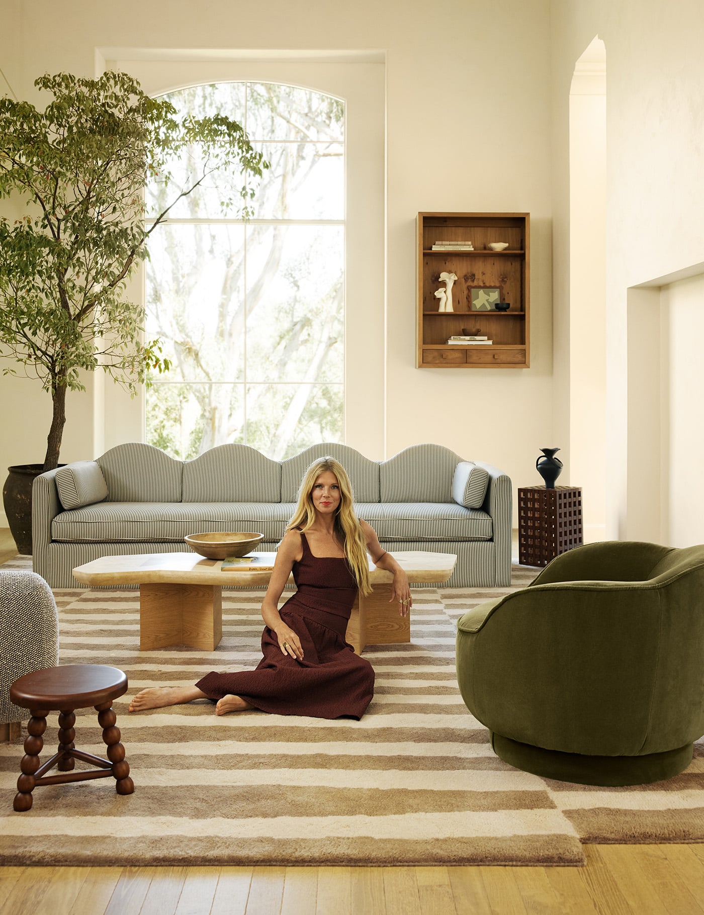
 I can hardly contain myself that A, we have a place to sit in our Palm Springs A-frame cabin and B, I love it so much I think I might like it better than our primary house and C, I can finally share a finished living room today!
When we first bought the place it was dark and very brown, from the carpet all the way up to the coffee-colored painted beams (you’ll see in the before photos below). I knew I wanted to brighten it up but you might remember from my original design post, I was planning to keep the rock un-painted, and I did for about a year. However, as we slowly renovated the house my mind started to change, and then when we painted the rock in the bathroom, I knew I wanted to go all out and paint the stone in the living room as well. What I like best about painting all the different surfaces the same color is that it not only unifies the space but also modernizes it without stripping it of all its’ character. The contrasting textures still show through but in a cleaner and much brighter way.

 You also might see we have a different sofa from what I originally had chosen. Unfortunately during the year of renovating, stopping and starting while we found different contractors, our brand new beautiful sofa (which was wrapped in plastic to keep out construction dust) became club med for every mouse in the desert. No joke, we had no idea until we finally got to unwrap the sofa after about a year, and it was completely covered in mice droppings with little holes burrowed throughout the material.
After some tears over it being unsalvageable, a couple visits from a pest control company and my falling in love with the Melrose sofa at Clad Home, we now have this gorgeous 10 foot beauty that turned my sofa nightmare into my loungey dream come true. I love the low profile and at 42″ deep it’s extra deep for optimal curling up and cozying into. Also, being white, it’s great that I can unzip the cushions and throw the covers in the wash.
 I splurged on the Albini rattan bucket chair so I knew getting the green safari chairs, from my dream design board, weren’t going to happen but luckily for me, a week before I needed to have the place staged for a shoot, I found these green camp style/safari-esque chairs on Urban Outfitters for a more reasonable price. It took me a year from when I put it out in the world that I was on the hunt for green safari chairs but these were worth the wait!


 In every project I do, I always like to mix in some vintage and custom pieces when I can and my own spaces are no exception. The nesting side tables (found at the rose bowl flea), the Albini chair I mentioned before (sourced from the Hi-Vibe), and the floor cushion (from The Vintage Rug Shop) are all vintage while the coffee table I had custom made and is a prototype of my own design (which will be available for purchase in my shop soon).
Pieces I love that come from more big-box type stores are sprinkled throughout as well, like the ceramic canister on the coffee table (from target), the vase from CB2, the rug from esalerugs.com, the basket from World Market (that I DIYed a little something to and that I keep forgetting to share about… note to self, I WILL post that how-to soon) and the gorge chandelier from West Elm.

And now for some side-by-side before and afters. We didn’t have to do a lot to this room aside from tearing out the carpeting, installing the tile floor, switching out the lighting, and a whole lot of painting, but it is still satisfying to see, none-the-less.


 I hope you guys enjoyed the tour! Next up is the bedrooom…
Shop The Post:
Sofa from Clad Home // Bottom Rug from Esalerugs.com // Top Rug found on ebay // Vintage Rattan Albini Chair sourced from the Hi-Vibe // Coffee Table by Sarah Sherman Samuel // White Ceramic Stool from Lulu & Georgia // Nesting Tables are vintage // Table Lamps from Joss & Main // Chandelier from West Elm // Tasseled Throw from Lulu & Georgia // Gold Urchin from Lulu & Georgia // Vase from CB2 // Floor Pillow from the Vintage Rug Shop // Green Chairs from Urban Outfitters // Gold Based Side Table by Lulu & Georgia // Hammock Chair from Amazon // Entryway Ceiling Light by Cedar & Moss // Paint Color is Polar Bear by Behr
To see all the posts and progress on our A-frame check here.
Photos by Sarah Sherman Samuel


Love everything about it! I actually really prefer the chairs you found to the ones you’d originally sourced. What happens in the space over near the ladder? I see a pillow up top… So fantastic to see it come together!
(as in, behind the ladder on the first floor—it looks like a room, is it a pantry?)
that is the bathroom! ha
Sarah, can you comment on the comfort level of the UO green chairs? are they moderately comfortable, or could you curl up with a good book and read for hours?
they are actually quite comfortable! The base cushion is pretty firm but the side cushions are very soft and good for curling up in. I was pleasantly surprised with them!
Wow! You guys did an exceptional job. I love the green chairs!
So gorgeous!!! Congrats!!
Is the floor vinyl planks? Love the color, was checking out a similar option to brighten up our basement. Love seeing all the progress.
The floor is porcelain tile
that coffee table is so good! first thing I noticed, whole place looks amazing!
I’m such a fan of what you do! I love how clean and crisp it feels! The white is just right 😉 Can’t wait to see more from your a-frame!
Oh I love, love, love it! Like everything else you do, just so beautiful.
and the hammock above the fireplace reminds me of my favorite place in Tulum, Coqui Coqui 🙂
WOW, you had some vision. What a transformation!
Love it! Good call on painting the rock. It looks so clean and fresh now! Im sure it would have looked fine left alone too, but I do prefer this 🙂 and I like the green chairs a lot too. I have a green sofa and sometimes I don’t love it (even though I love green) because I have a hard time deciding on other furniture to go with it. Eventually I want to replace it but for now it’s staying, so I really like seeing your furniture color combo. What a fun vacation spot!
I’ve spent a LOT of time in Palm Springs over the years (my grandfather was E Stewart Williams 🙂 and I can say with my whole heart that this space is fantastic! I absolutely would’ve painted the rock white as well. Texture goes a loooong way. Also wondering about the quality of the esale rug? I’ve had it in my cart for some time but can’t seem to pull the trigger!
Ah thank you! That is so great to hear and I love that esalerugs rug. I have used it in three spaces now! It’s great quality for the price especially for the really large size.
Did eBay have more of the top rug? What is the brand? This space is so beautiful!
Love this space! The top rug you mentioned is from eBay, any tips for finding a similar rug? Any search terms you recommend? Love it all!
Search black and white kilim!
So beautiful!
I was wondering if you could tell me the rough dimensions of the living room? Strange request I know, but we’re looking into building an A-Frame extension onto our house and I love the size of your living space and think it would be just the right amount of room for what we’re wanting. Thank you! <3
[…] Sarah Sherman Samuel […]
Wow, what a transformation. Amazing what white paint can do to transform a place from drab to bright and light! Was that a homecrest chair in the earlier sofa photo? Love the clad home piece and those green chairs. Also, the bit of green/white kitchen showing!
Really lovely! 😀
yes! good eye! 🙂
Love your blog and I get lots of inspiration. A-frames are a cool architecture feature that almost force simplicity due to the challenges of working with so many angles.
We are just starting the remodel of our Colorado A-frame cabin and documenting it at http://www.valleyviewaframe.blogspot.com.
[…] SARAH SHERMAN SAMUEL […]
This room is beautiful! We love the subtle hint of green in the space.
Hi Sarah! Really, really love this space! I’m about to pull the trigger on that esalerugs.com rug, but noticed you linked to the gray one. Is it a trick of the light? It looks like you have the black one. Want to make sure before I purchase, because I love how it looks in your space!
A whoops! Sorry I have used the grey one in a different house. This one is the black and white one.
What size is that black and white kilm from esalerugs?
[…] 5. As far as I’m concerned, everything Sarah Sherman Samuel touches turns to decor gold, but never have I been so in love with her work as I am with their A-frame living room reveal. […]
[…] via […]
[…] gorgeous is Sarah Sherman Samuel’s A-frame in Palm Springs (above)!?! Definitely go here to see the before and […]
Hi Sarah! I’m ordering that sofa from CLAD and wondering what length and depth you chose and whether you customized anything else – like the height?
mine is 110″ long and 42″ deep. Everything else is the same. I also upgraded the cushions and got some special stitching which I forgot what it is called but if you work with someone they can look up my order!
Xo Thanks!
What color fabric did you go with?
[…] […]
[…] have been eyeing these chairs from Urban Outfitters that Sarah Sherman Samuel used in her a-frame living room makeover and they are finally back in stock!!! We just grabbed 2 for the Gentry House. You should snag a […]
[…] of you, including myself, thought I might be crazy getting a white sofa with two dogs and a toddler boy in the house. However I couldn’t get over my want for a sofa […]
[…] this before-and-after. The A-Frame was featured in this month’s Sunset Magazine, […]
Love it. I’m debating painting my rock fireplace as well. Can you please give me some tips? Primer, any specific paint used or steps taken?
I hope you still see this since it’s an old post, but I have the exact same stone on our fireplace that I’ve been wanting to paint but I’m worried about it blackening. Is your fireplace functional?
[…] image via […]
[…] Design by Sara Sherman Samuel […]
[…] or above a bed. But there are some original twists on the hammock as wall decor too – like Sarah’s idea to put a mini one over a fireplace in her Palm Springs a-frame. Genius. I’m particularly […]
[…] of you, including myself, thought I might be crazy getting a white sofa with two dogs and a toddler boy in the house. However I couldn’t get over my want for a […]
[…] really, really love to add beams and white paneling to the ceiling to accentuate it a little more (like this), but for now, we’ll just enjoy the sweeping smooth white […]
[…] really, really love to add beams and white paneling to the ceiling to accentuate it a little more (like this), but for now, we’ll just enjoy the sweeping smooth white […]
[…] price. Urban outfitters comes out with some shockingly good furniture sometimes (like remember these green chairs from the a-frame?! they are on a […]
[…] Sarah Sherman Samuel Source unknown- found on Pinterest Danielle De Lange Design Sponge Dudleyworl Dabito Amber Lewis Source unknown- found on Pinterest […]
I love this so much! Also, so great to see you used Polar Bear by Behr. Its my favorite white, and used throughout my home.
[…] or above a bed. But there are some original twists on the hammock as wall decor too – like Sarah’s idea to put a mini one over a fireplace in her Palm Springs a-frame. Genius. I’m particularly […]
Ya, I really enjoyed the beautiful tour of this home. The decor looks absolutely unique and amazing. Thanks a lot for sharing these wonderful pics. Looking forward to your next amazing tour.
[…] […]
[…] image source […]
Are there any details on when/where the coffee table will be available? Thanks!!
Thanks for you interest in the coffee table. We are working really hard to make those available this year, so stay tuned to future posts, they may be available sooner than later!
[…] all went wild for Sarah Sherman Samuel’s Palm Springs living room in our last vote (so much so that I wouldn’t be surprised if a Copy Cat Chic reader bought […]
Can you tell me the size of the black and white kilm rug in the living room?
You`r talanted!
[…] line of furniture and “The Pentwater Round” which is seen here, as well as the “Pentwater Octagon” (which you may remember from the Christopher Kennedy Showhouse and my desert A-frame), are […]
[…] sarahshermansamue … […]
[…] via MyDomaine via Sarah Sherman Samuel […]
Hey, I know this is an older post, but did you use the same color paint (poler bear) on the exterior as the interior? Painting our exterior and our brick is very textured. I like how this paint took on your rock so hopefully it will end up similar.
That is one very good post you have written! Thanks for sharing!
[…] Source: sarahshermansamuel.com […]
[…] now onto the tour… my favorite space in the house is hands down the living room. It’s the large open lounge comfy room of my dreams and is definitely something I want to […]
[…] sofa I immediately thought of Clad Home since they made the incredible sofa which we had in our Palm Springs A-frame and then moved to the rental house while we renovated and is now currently in the basement living […]
This is an awesome post! I really appreciate all of the details and the before and after photos showing the change. It is really helpful to have a list of steps and things that you feel made the most difference, and I can really feel the calmness in your photos. Our house is pretty good, but is missing all of these decorative details that personalise the walls and make me feel at home. Thank you for writing such an informative and detailed post!
Such a relateable post- it hits on the exact spot most of us feel. Most of us would love our homes to look Instagram or blog-worthy but few of us have the funds to do a complete overhaul. Thanks for writing a post about how we can make small, affordable changes but make us feel more at peace with our decor.
[…] to sweet. I love it all and hope to get a chance to put it into a new home soon. Mood board 1: A frame house by Sarah Herman Samuel, sling chair from Weylandts, eucalyptus garland Mood board 2: Flowering gum […]
[…] | Set Dwelling | Down The Rabbit Gap Wines for Spell | Jenni Kayne | The Three Birds Renovations | Sarah Sherman Samuel | Pop & Scott | Ezz Wilson | SF Woman By […]