Last week our bathroom renovations for Vanessa Carlton’s NYC loft was featured on Arch Digest did you see? Head over there for the story which is punctuated with a video of her giving a tour of the entire home.
Vanessa’s loft is one of those incredible new york apartments that inhabit an entire floor of a building, the ones where the elevator opens right up into the living room space. When I first arrived I immediately was taken by the 1892 built building and the original architectural features that were still in tact. The living room, kitchen and bedrooms all had the original exposed brick and so much great natural light it was an inspired space with a couple of eye sore bathrooms. We wanted to bring the essence of the building back into the bathrooms in an interesting way… classic and timeless but with the sss touch.
So let’s take a look at what we started with in this principle bath.
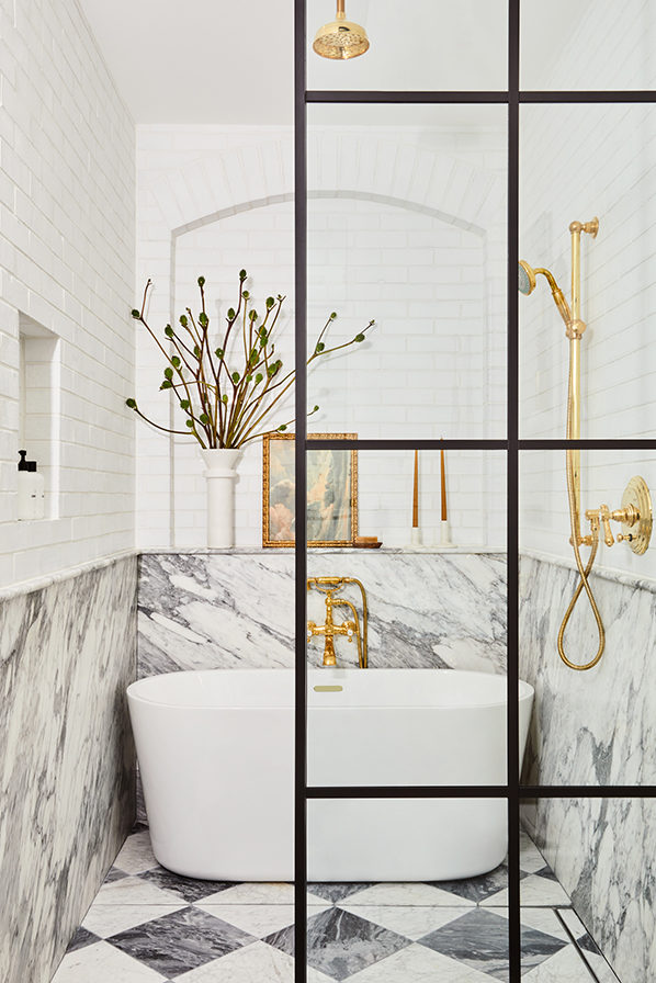
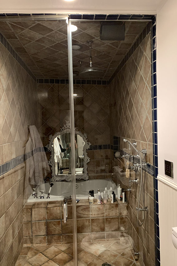
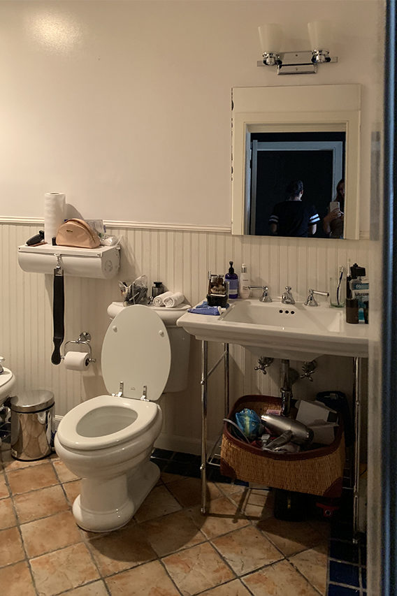
The old shower/bath was cavernous with the dark tile, there was only one sink with no storage and the bulk of the space was taken up by a separate toilet and bidet. We stripped everything down, moved the toilet over in order to make room for a custom double vanity, replaced the beadboard wainscot with marble, installed tall medicine cabinets, these stunning sconces and the harlequin marble floor. One feature I loved in the rest of the house was the brick work above the windows. I used Fireclay’s brick tile to mimic the brick in the rest of the loft and created a giant arched niche inspired by the windows throughout.
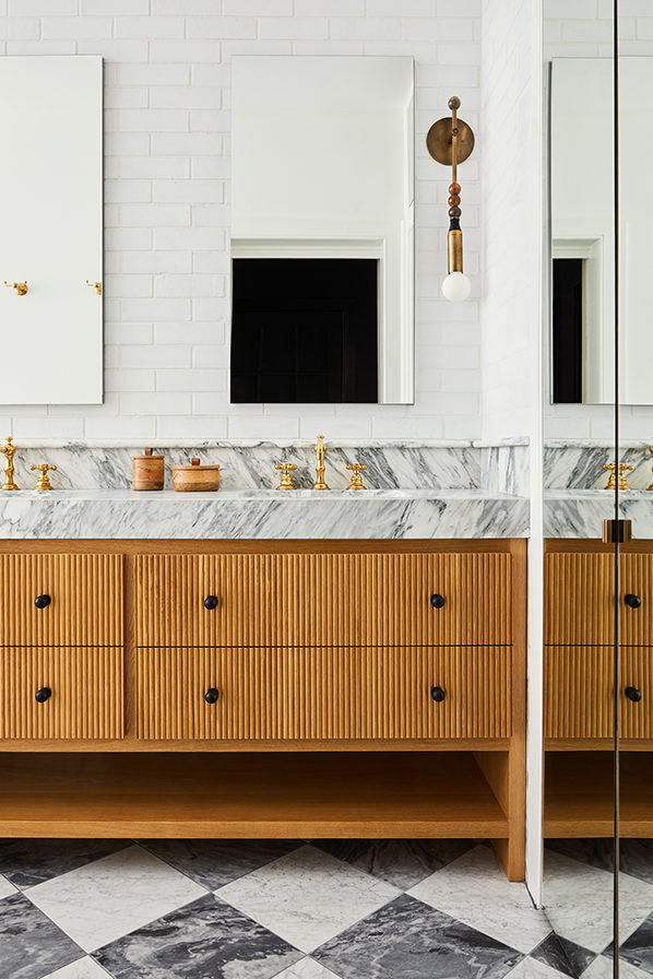
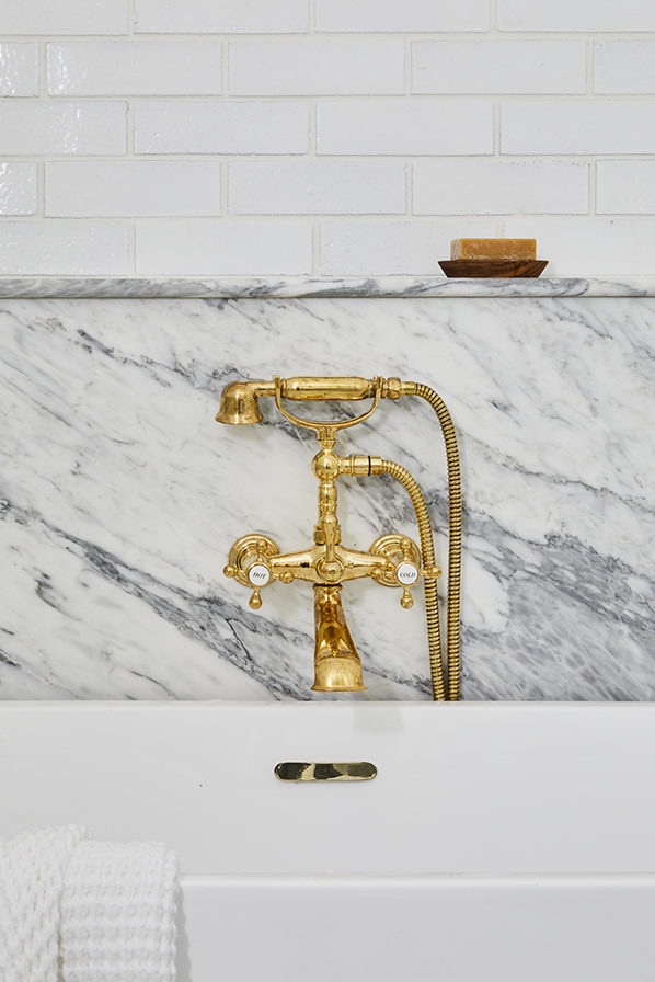
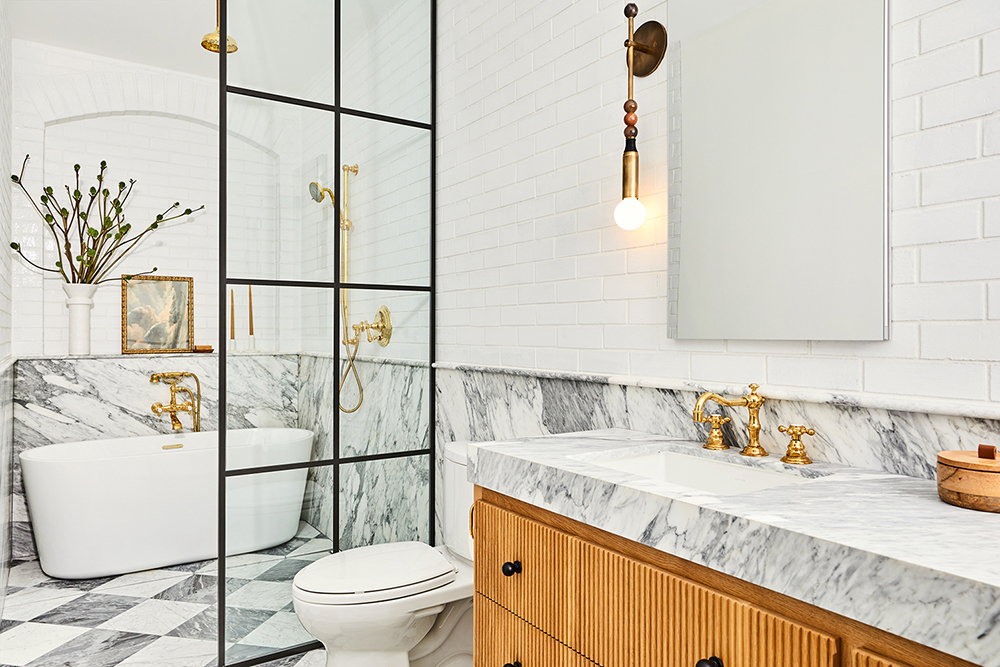
Now if only I could find a way to sneak a bath in here. I haven’t had a chance to see the finished space in person yet (for obvious covid reasons) but I was able to style it via Facetime with my NYC project manager Kelsey while Nicole Franzen took photos.
Now unto the other bathroom!
Vanessa’s one request for this bathroom was that she wanted tile work that looked similar to what would have been around the turn of the century when the building was built and I was happy to oblige. I created a simple graphic pattern with the tile and used a soft neutral color palette for a fresh take. The wallpaper and the floating vanity pushes it more modern and I live for the juxtaposition.
Let’s see what we started with…
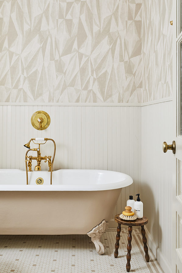
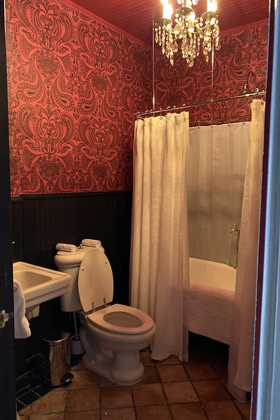
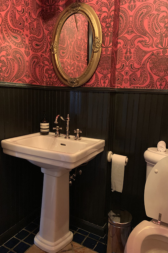
That tile was the first thing that needed to go. We were able to keep the original beadboard and the clawfoot tub but re-finished them both.
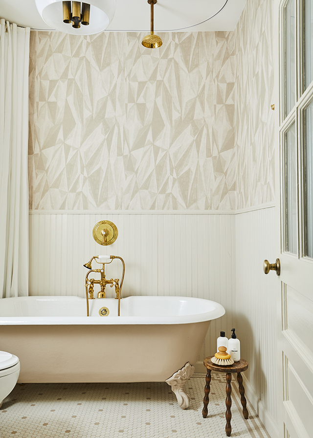
Get the look: Vanity Light is by Hudson Valley Lighting // Overhead light is vintage // Stool is vintage – similar here // Wallpaper by kelly Wearstler // Vanity is custom // Faucet collection // Mirror from World Market // Bathtub is Vintage
Principle Bath: Brick Tile by Fireclay // Custom Vanity // Sconces by Apparatus // Bathtub // Faucet Collection // Bath Faucet
Photos by Nicole Franzen

I am in awe of these afters. But please tell me what that thing on the wall between the toilet and bidet in the first bathroom before is!
How do you find people to make these incredible vanities!
The combination of black and white marble is always a good choice, gaining luminosity, effect of more space giving the environment a touch of elegance. But the white marble washbasin with golden veins in line with the bathroom fittings was excellent!
[…] Bathroom dreams. […]
Where is the marble vessel sink from?!!!!
It would be really helpful. Thank you!
Would love to know the paint colour on the claw foot! So pretty!!
A second for the color of the claw foot tub! I’ve been looking for it indicated and haven’t found it yet. It’s really perfect.
Would love to know where the marble floors in the first bathroom are from? Love the color of the black marble!
Flashing Content!! Great, keep up.