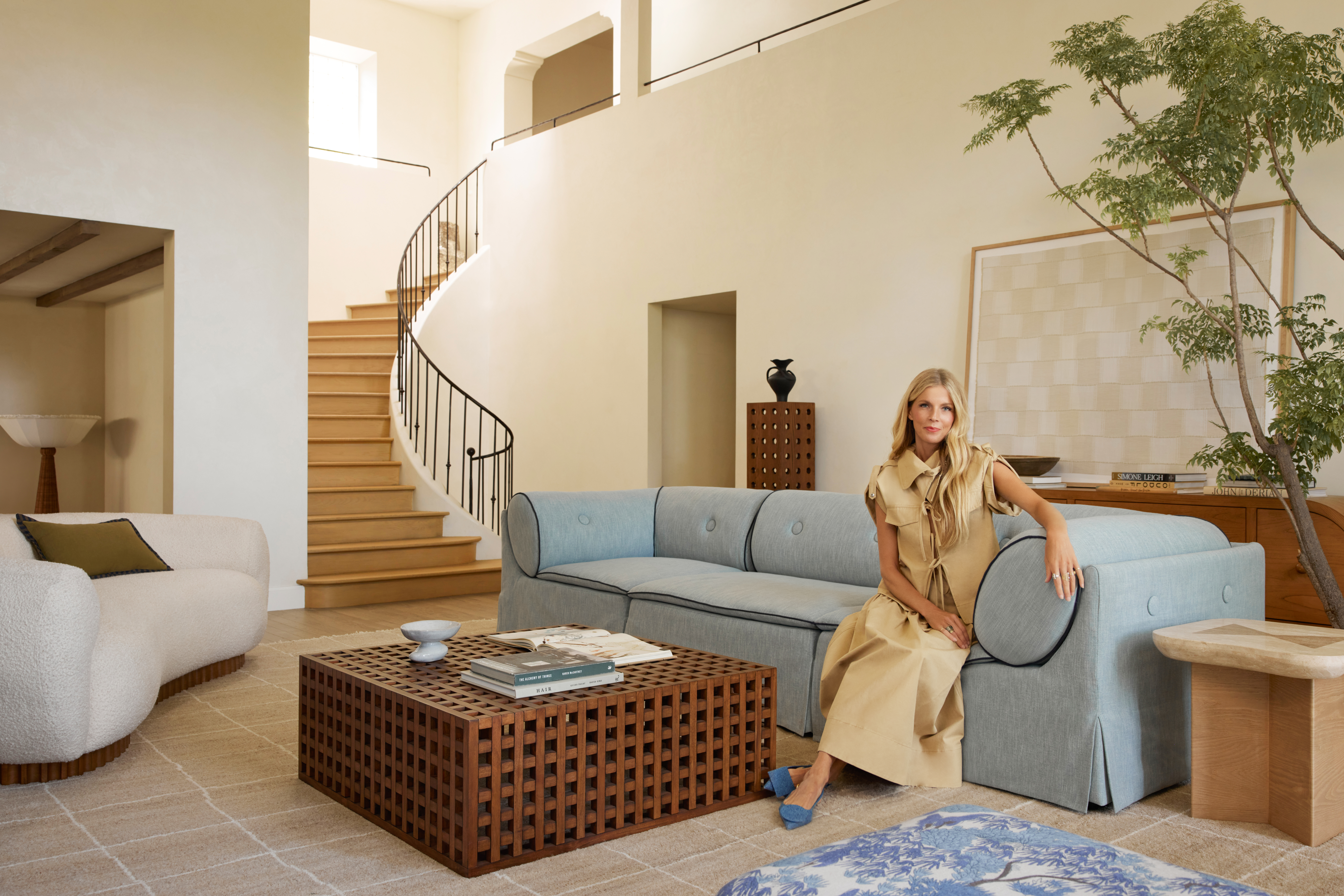
 I have yet to photograph the #samuelfamilyfixer for myself and to show you guys the full tour (but this image from the shoot for Domino Magazine is still giving me life, as are the nightly baths right in this spot), so in the meantime I wanted to give you a look into what my non negotiables were for my dream master bath and delve into the design and making of it.
When we moved in there was an un-used and unfinished “hot tub room” just off the master bedroom (which you could also access from clover’s bedroom) that I suppose once had a hot tub in it, but by the time we got there it was by name only. Essentially, it was an un-heated and unfinished exterior room with decking for the flooring and plywood walls but it was a good amount of space and it had the best light with all the windows. The master bathroom at the time had almost no natural light and was divided up into two small rooms, one with the sink/vanity and the toilet and the other had an alcove bathtub and closet. Here is a look at the “as-built” floor plans and then what our plans were for the space.

As you can see we gained a ton of space by opening things up and finishing off the “hot tub room”. It allowed me to check so many things off my must have list. I shared these plans on stories way back when we started and I got quite a few questions about why the toilet isn’t concealed in any way. To me it is already a huge step better than what it was before where the entry door looks directly at the toilet and it is 10 steps better than what we have in our LA bathroom where the toilet was also front and center and we didn’t even have a door to the bathroom. ha Now that we have been living in the space I can tell you the toilet placement is all good and I like that it is tucked to the side where it isn’t the first thing you see when you walk in. Keeping the bathroom open and giving it a feeling of breathing space was much higher on my priority list. Speaking of my priority list… let’s get down to it.

- A BATHTUB (preferably freestanding):
I have never had a bathtub in a master bathroom of my own which is so sad because I am a total bath girl. Putting one in our new bathroom was at the top of my list. It just isn’t the same experience when you have to clear out 1,000 kids toys before taking a soak. I have always loved the sculptural aspect of a freestanding bathtub and a bathtub with a view takes the cake. When we first saw the “hot tub room” we knew the nook with all the windows would be the perfect spot for one that would check all the boxes. I found our tub on Wayfair which is still a go-to site for bath fixtures as I can find things like this unique pedestal tub quickly and, more often than not, they are priced the same or even better than I can get with my trade discount from other vendors. - NATURAL LIGHT (broken record, I know)
I want windows in all the rooms please. The more the merrier. In most of the house we don’t have window coverings but since the tub is basically sitting in a fishbowl a secondary must-have came up which was roller shades… - ROLLER SHADES
I wanted the window coverings to be very minimal and modern. Not distract at all from the view when they were not in use so we turned to the experts at The Shade Store and had them install their Park Rollers. We even have them motorized so with the flick of the button they go up or down and it has me feeling very James Bond-ey. - SPECIAL TILE
Tile is probably my favorite part of every renovation and I have gotten to use some really incredible tile in client projects. I must have gone through a million options before landing on the plan for our master. For my own house I wanted tile that felt incredibly special but not be so distinctive or trendy that I would get sick of it or that it would look dated in a couple years. One way I was able to hit the mark was by using a classic shape (Clé’s Modern Farmhouse Glazed Brick) in an interesting/different layout (more on this soon). For the floor we went with Clé Tile’s natural zellige in 2″x2″ sheeted. I can’t even begin to say how much I love this tile. The handmade quality, the color variation, and the smooth soft feel (since it is unglazed) all bring character and warmth to the space. - INTEGRATED TROUGH SINK/VANITY
Similarly to the bathtub, I wanted our sink/vanity situation to be all about form (and obviously function). I designed ours to be all one piece, the sink is integrated and the entire console is made out of white concrete. Images to come! I found the brass wall mount faucets on Wayfair. - ROOM FOR SO MANY PLANTS
Even in our small LA bathroom, I found a small space to squeeze in a plant but in my dream bathroom I’d have dedicated space for multiple plants. Like natural light… the more the merrier. Plants in a bathroom bring life to all the hard fixtures and finishes and help create a spa-like vacation vibe (which with the winters here, lets be honest I NEED). The two windowed alcoves on each sided of the bath made an ideal spot. - STORAGE
Everyone’s bathroom storage needs are SO different. No matter how much I aspire to be, I am not a beauty product girl. My skincare routine currently consists of the Tacha face oil. PERIOD. that is it. I fell off the horse. I loved the SK-II when I had it and should probably order more, but somewhere between all the renovations and moving around a cleanser is all I could manage. And then make-up… my 5 minute face is the same one I use for around the house as I would for a night out (well sometimes I add a brow pencil if the occasion is REALLY special). My product list there is a tinted moisturizer, a concealer, mascara, blush, powder and a lip stain. I literally have one of each. One color blush… oh but I do have a few colors of lip (like 3). So all this said… I have very minimal bathroom storage needs. The basket under my vanity is more than enough but we do have razors and medicine and things we don’t want our littles to have such easy access to so I did utilize my favorite trick for adding a ton of usable storage without taking away any square footage from the bathroom which is installing a full length recessed medicine cabinet. I found this one on Wayfair and it is basically 6′ high by 15.5″ wide so it slides right into a standard 16″ space between studs. We installed one in the kids bath too. - HEATED FLOORS
You may remember that we installed Warmboard radiant heated floors all through the house (which is proving to be one of the best decisions) but we have the master bathroom on it’s own thermostat so we can really crank the heat in there for extra toasty floors when you get out of the bath or shower. - HOOKS
Hooks are good for everything, robes, towels, clothes. They are small, non-invasive and super practical. - A SHOWER WITH A HAND SHOWER
Similarly to the bathtub, I’ve never had a hand shower. The first time I stayed at a friends house with a hand shower and washed my hair it felt like I just had gone to the salon. I have very thick and long hair so having the water just come from above doesn’t really get through to the scalp just above the neck. How did I ever get clean before this bathroom, I don’t know 😉 (my hair was definitely greasier).
See the before tour of the house including a shot of the master here. Catch up on all things #samuelfamilyfixer here.
SHOP THE LOOK:
Bathtub: from Wayfair // Faucet from Wayfair // Sconces: by Allied Maker // Robe: from Wayfair // 71″ Medicine Cabinet from Wayfair // Roller Shades by The Shade Store (Park Rollers) // Floor Tile: Clé Natural Zellige // Wall Tile: Clé Modern Farmhouse Brick in Matte White // Wall Mount Faucets: Wayfair // Hooks: Amazon // Mirror: From Urban Outfitters … Find Similar Here // Wall Hooks: Amazon // Planter one: from Wayfair // Planter two: From Wayfair // Bamboo Stool: From Wayfair // Toilet: From Wayfair


Do you have any comments on solid surface versus other materials for a tub? This particular tub is beautiful and not super expensive. I wonder how it’s holding up to daily use. Does it scratch or discolor over time?
I’ve used it almost every day since April and so far so good.
Hi Sarah! Where is the hand wand and shower head/faucets from? LOVE IT (and everything here).
Ah yes sorry I missed that one! It’s from rejuvenation.
Did you have to seal the unglazed zellig tile for the bathroom floor like 10x?!?!?
I love the Zellige by Cle as well as other cement tiles but worry about its use on bathroom floors with water and around the toilet….
Not quite ten times but yes a bunch 🙂 the process isn’t very laborious
Hi-
What grout widths did you use for your tile install. Love how that turned out!
K
How does that tile feel on your feet? Are there rough spots where it’s irregular? It’s so gorgeous and the organic texture and color is so warm and interesting, I am just curious about the practicality.Considering options for our bathroom re-tile.
It feels soft actually! the variation is nice underfoot. Like walking over warm soft stones in a beach.
You rock with your writing!! Spectacular one for sure.
I can’t wait to see the full house tour! Does the door really swing out into bedroom? If so, what was behind that decision?
Yes it does! If it swung in it would block the bathtub and probably hit it. Swinging out into the bedroom there is a ton of space and it backs to a wall so it is always out of the way when open.
[…] first noticed zellige tiles pop up mid-last 12 months, favored by Emily Henderson and Sarah Sherman who used it to replace their bogs, and Joanna Gaines who did this very cool factor with hers, […]
How is the soaking depth of the tub? I love the look but I’m worried that the pedestal takes away from valuable soaking depth? But maybe not? What are your thoughts?
Not a broken record at all! Lighting is incredibly important and makes all the difference in how comfortable a bathroom feels. Thanks for sharing!
That is one perfect bathroom !! Thanks for sharing your ideas for a dream bathroom!
Great post !
If you are considering of putting a hot tub in your bathroom and you have space for it, i recommend of doing it !
Great article !
Thanks for sharing this information !
Great article !
I so agree with having as many windows as possible in every room. I personally love a bright house with lots of light. I gor so many ideas from your blog Sarah. Thanks for sharing!
Can you share links to the shower with handle
[…] I first set out to design this space and turn it into our bathroom, I had a long wish list and a very small bathroom, but we made it all happen thanks to an unfinished “hot tub […]
I like the layout of your site. Great post. Thanks for sharing!
You have a very informative site with a lot of great content!
Hi, I can’t find the “Park Rollers” on the Shade Stores website. Can you elaborate? Also, did you go with pure white? Thank you!! I love this bench too, wish I could find it!
This is very resourceful. Great tips and advice!
This site is really resourceful and full of great ideas!
Wow! looks great, I love the way you chose the color of it. Thank you for sharing your ideas and design. Recommended!
I bought similar sink faucets. I’m having a hard time finding shower faucet systems that match the color gold of the sink faucets. The shower faucet systems I’ve found are not a gold that is nright and vibrant as the sink faucets. Do yours match pretty closely?
I love the amount of detail you provide!
I love your ideas! great tips and awesome site layout!
Love your style! Thanks for sharing 🙂
Thanks for the great tips and advice!
I agree with you guys completely!
Yes, thank you so much! Great content!
I really love you ideas! Thanks!
Oh, wow! I really like it. Taking a bath with this view is brilliant!
This was very fun and nice to read! Congrats!
These are definitely some really great ideas!
Wow if only we all had a view like that in our bathroom! I bet it is so nice having a hot bath in the evening looking out the window. Do you have any special landscape lighting outside to compliment? Or are you able to see the sky/stars from the tub??
-Dylan, visit us https://www.mississaugakitchenandbathrenovations.com/