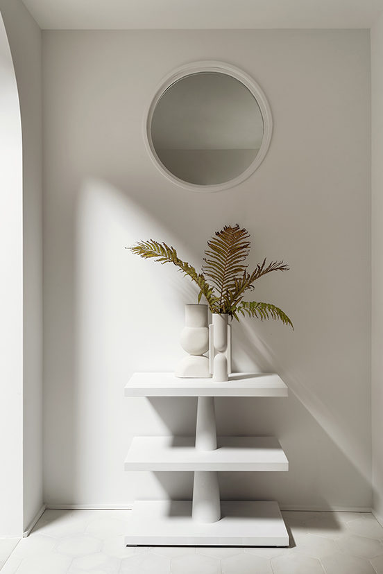
Our kid’s bath in our SamuelfamilyFixer was previously the laundry room and when we removed the bathroom near the kitchen (to make our pantry) we knew we would take over the laundry space for bathroom that was dedicated just for the littles. It gave me the opportunity to flex my favorite kind of design muscle, and add a little whimsy into the space while still keeping with the aesthetic of the rest of the house. The room was dark and had no windows, as it has no outside walls, but that didn’t stop me from adding a round window, front and center above the tub, which looks into the more light filled entryway and created a beautiful moment on both sides of the wall.
But back to the bathroom…. I had a short must-have for this space…
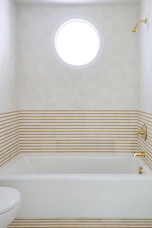
a bathtub, a patterned tile of some sort, and some natural light.
Adding the window took care of #3 and for #1 I turned to the bathtub I have used over and over again in various projects, the Bellwether Kohler tub from Wayfair.
Once I got on Wayfair to Pin the tub, I quickly added this sink, this faucet, toilet and shower trim faucet as well. Such an easy one stop shop.

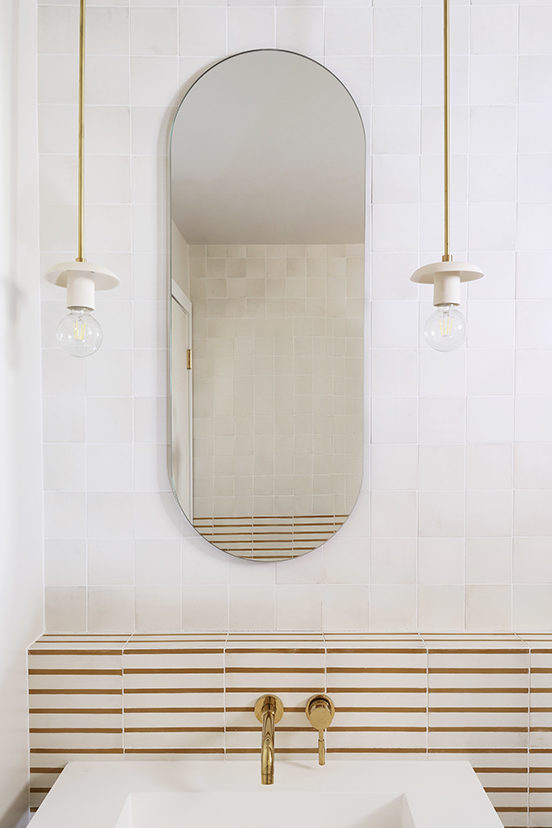
For the tile however, I knew I wanted to do something a little more custom and Granada Tile made my customization loving tile dreams come true. When you go to the site you can “Browse Tile” this will lead to all of their different collections. My favorite grouping is their Echo Collection. Once in there you have countless patterns and stripes (and solids) to choose from. To make it super easy to visualize any customization they have the option to be able to drag any of their 40 colors to a tile to change the color and it automatically updates to show you how the tile will look in repeat form.
For example… I picked the Chicago 84 pattern and when you click on “customize” this is what pops up.

Now I might have had a little too much fun trying out patterns but it definitely made the decision making process so much easier. I threw together a quick (messy – just for myself) photoshop rendering of the vanity view and plugged in all of the patterns I had created on the Granada site so I could visualize it in situ.
Of course you now you know the one I chose but what you haven’t seen are these fun runner ups.
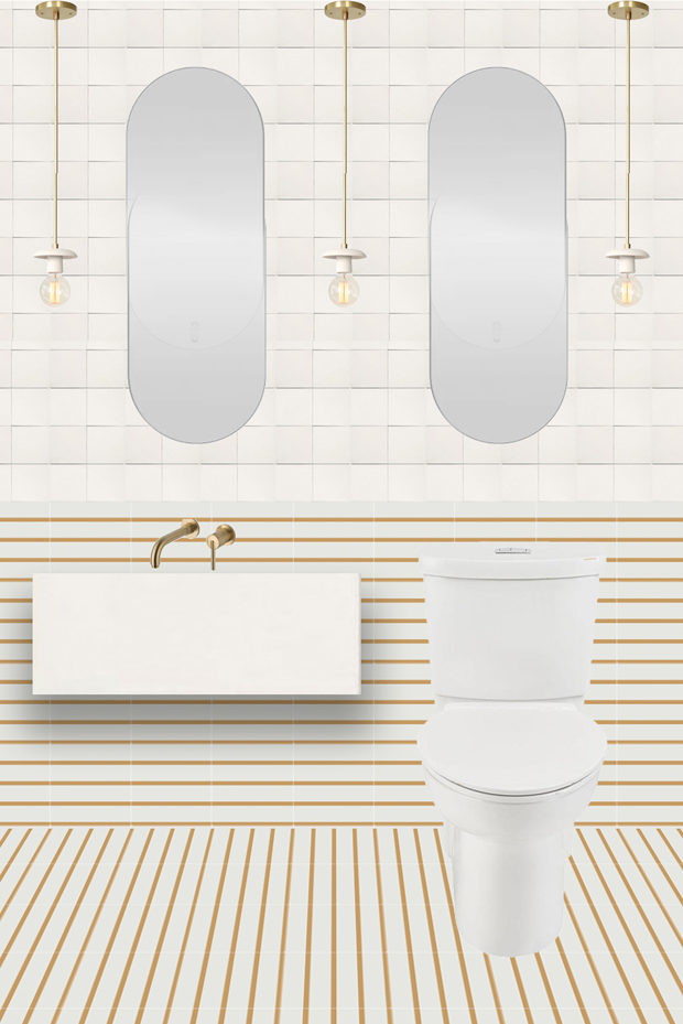
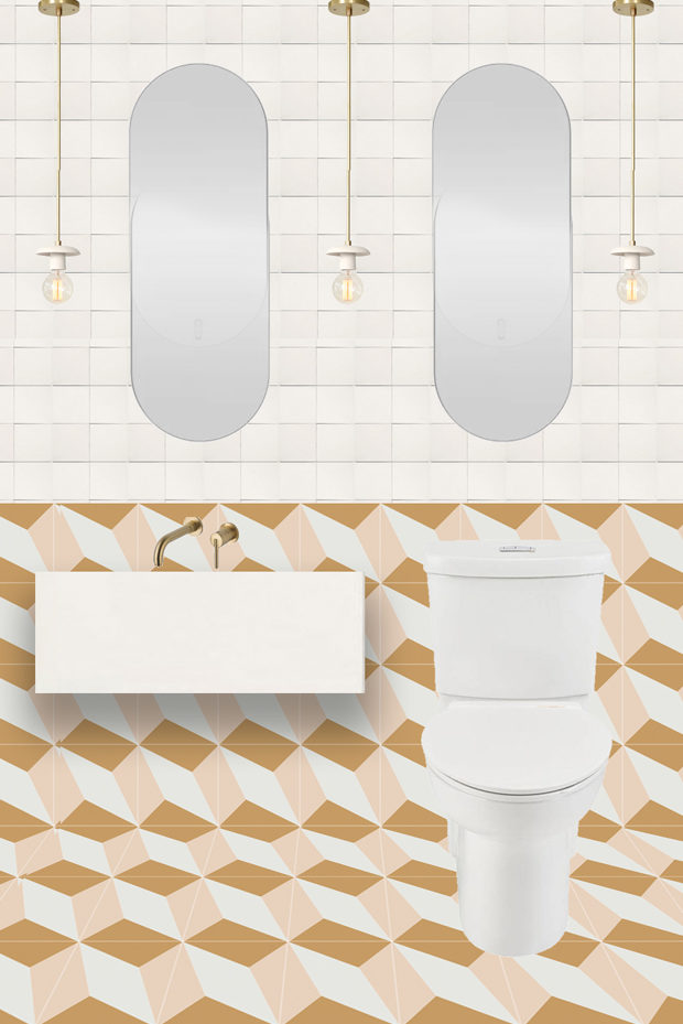
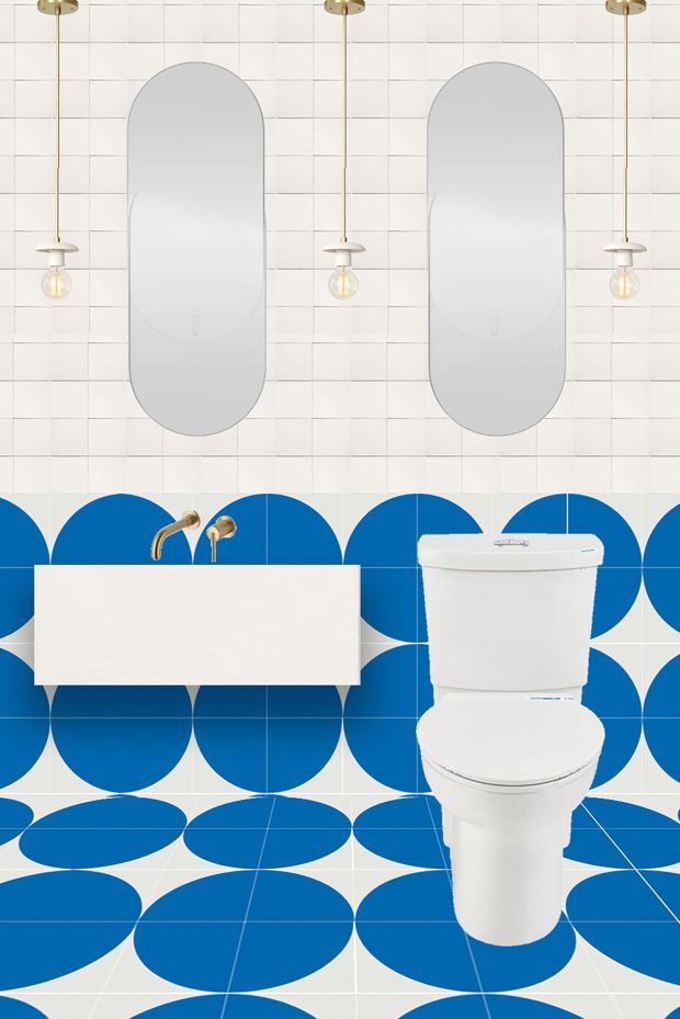
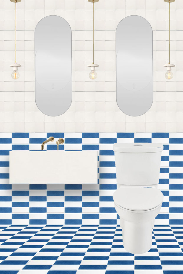
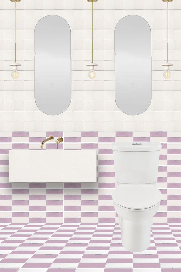
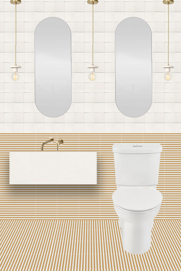
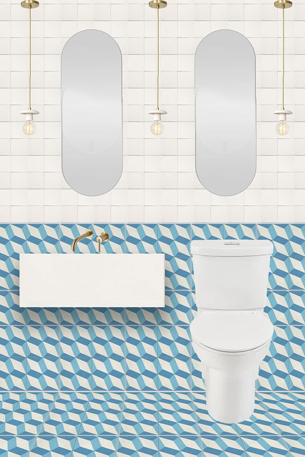
So fun right? try not to fall down a tile design rabbit hole!
Sources: Striped Tile from Granada (Chicago 84 in Caramel and white) and White 4″ squares // Sink from Wayfair // Sink Faucet from Wayfair // Shower/Tub Faucet // Mirror is custom // Bathtub From Wayfair // Pendant Lights but Cedar & Moss // Rug by Sarah Sherman Samuel for Lulu & Georgia
Photos by Matthew Williams for Domino Magazine

Hi!
Can you please tell us more about the round window shopping experience? I am currently looking for a round window to put in the pitch of our garage roof, to let in some natural light. What is the source for your round window? All
Tips, including framing most welcome. Thanks!!
This room is so fun! Love it!
I love the easy, effortless look. So simple yet so sophisticated! Love it!