
When we last left off, everything had just been framed in. The framing stage is instant gratification; it happens so fast, and then—boom!— there is a structure. After that, the finishing and the behind-the-scenes things take some time, like electrical, insulation, roofing, etc. All of that, however, leads to the next big, exciting day…windows and doors day. Seeing the huge Marvin Modern Direct Glaze 12-foot picture window go in was extra-satisfying, as it was all one piece. In and done. Well, almost; the interior walls still needed to be finished, but with the windows and Marvin Modern Multi-Slide door installed it all became real.
After windows and doors and passing of various inspections, we were able to close it all up.

And then came paint! We used “caviar” by Sherwin Williams (same as the house).
 It turned out exactly as I had dreamed it would. Thanks to KLH for figuring out how to make my vision happen (the structural engineering) and Ayers Construction for bringing it to life. My favorite part of the exterior is seeing that glowing nature pass right through the large window and the glass doors beyond.
Here’s a video we shot of the entire process from start to finish; it might be the most satisfying thing I have ever watched.
And now for a peek inside!


The footprint of the shed is just 13-by-30 feet, but I managed to carve out spaces to accommodate the variety of work that comes with a creative studio. I work best in a space where I am able to spread out and keep certain aspects of projects front and center, but then can hide away clutter and office things that aren’t so pretty (yes, printer, I am looking at you). So for my computer stations, I have one, long 12-foot desk that gives me a good amount of workspace to stretch out in. As planned, I (but mostly Pop Pop per my direction—ha!) built the desk into the windowsill, which gives 4 extra inches of space without jutting out further into the room. Since the room is long and skinny, we are utilizing every inch. By sitting the desk flush with the bottom of the window, it looks as if it floats off into the nature beyond. We built the infinity pool of desks! The streamlined desk echoes the minimal design of the windows, both with slim lines and nothing extra. When sitting there you feel surrounded by nature but still completely protected from the elements, and in Michigan that is a must for more than half the year. I’ll be in this space year-round, so it’s important the massive window and door are double pane insulated glass and made out of materials that are specially engineered for all the extreme weather (they’re actually not made out of steel!).
On the opposite wall I installed floating shelves that became a large vertical workspace where I can keep current projects at a glance. I use the shelves as a place to group different finishes and materials for interior projects, as well as a space to develop new SSS products.

In order to keep the clutter at bay and stay organized, I have a ton of closed storage on the back wall, with 8-foot cabinets that stretch wall to wall. I designed the structure with the idea of reusing the old cabinets that we tore out of the kitchen and installing them here, and I couldn’t be happier about it. The cabinets are beautiful and the perfect amount of wood to add warmth to the space. They house the printer and office/art supplies, as well as my sample library. They are on their way to filling up, but so far so good. I might have to get ruthless with the sample library eventually, but for now there is room to grow.
The scalloped dining table serves as a place for meetings and lunch, as well as another work surface. I also managed to carve out a corner for my own art and personal creative projects, which I haven’t had for so long.

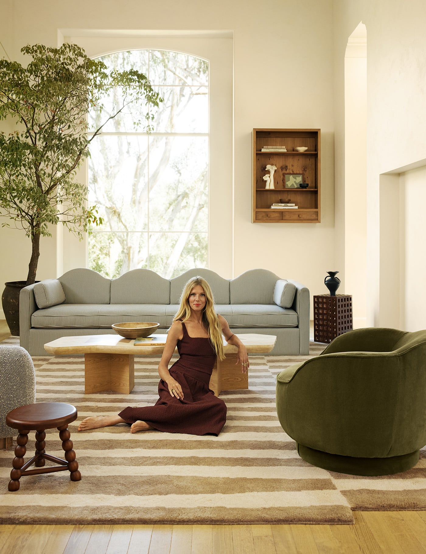
Finally, a cozy seating area with art from friends and artists I love (even a piece from my son, Archie) is a place to get inspired, take a load off, and make a list or 10 while taking in the view.
 For a further look into our new studio check out an interview on Domino Mag today!
SHOP THE LOOK: Marvin Modern Multi Slide Doors // Marvin Modern Casement Windows // Marvin Modern Direct Glaze Windows // Office Chairs from Lulu and Georgia // Desk – DIY to come // Rug by Sarah Sherman Samuel for Lulu and Georgia // Floating Shelves // Vintage Upholstered Chairs from Shop Nueve // Pedestal Table from CB2 // Vintage Pedestal Bowls // Vintage Travertine Table // Art wall, from top left: Wit & Delight, Rebekka Seale, Wit & Delight, bottom two pieces by Archie and me (see how we made them here).
See the previous post with plans and design here.
Photos by Sang An
Timelapse video by Sarah Sherman Samuel for Domino + Marvin

This is SO stunning. I would love to work in a space like this everyday. Now for a really boring question…is there a bathroom so you don’t have to traipse back to the house? Thank you for sharing your journey!
haha there is no bathroom, the house is just a very short walk away and a good excuse to get the body moving.
Hi Sarah!
I am curious if you have completed the tutorial for the custom desk yet? Given the crazy times we live in, I am needing to build a custom desk and I truly love what you created with your pop:)
Best,
Kevin from Denver, CO
Well done! I love it. Fascinating to watch the video, and also lovely to see the changing of the leaves as you transitioned to fall.
Beautiful and inspiring space for you. Can’t wait to see the projects that get dreamed up there.
Hi Sarah! Huge fan and fellow Michigan resident. I was wondering, did you find some way to heating and cooling your new studio space that was ‘attractive’? I didn’t see from the photos, but I wasn’t sure if you did in floor heating, or something else. Thanks!
Hi! We installed a split unit for heating and cooling. It wasn’t installed yet when we took the photos so I will share more soon. x
I’m sure you’ve already answered this somewhere in a post or DM or reply to someone else, but is the studio cabin heated & air conditioned? Also, just curious, why only one skylight?
Anyway, I’m exceptionally jealous and were I Rupert, I’d hijack at least 50% of the studio’s usable hours.
Beautiful job!
HI! There are two skylights. and yes the studio has a split unit for heating and cooling. Rupe has definitely worked his way in there. 🙂
Hi Sarah! love your work. I was wondering what the siding was that you ended up using. I love the vertical lines and narrow boards. Thanks!
Can you tell me the exterior color? I love it!
I hope you don’t mind, but I just had to use one of these photos or your gorgeous new studio as my new Zoom background for work! Everyone cannot stop commenting on how beautiful it is! I’ve been reading your blog for a few years now and just love your design aesthetic and personal style!
I was wondering what you used on the exterior of this building?
Thank you. It is incredible.
Hi Sarah! Is a desk DIY still forthcoming? Would love to learn more xx
Such a calming space. What color did you paint the interior? Thanks!