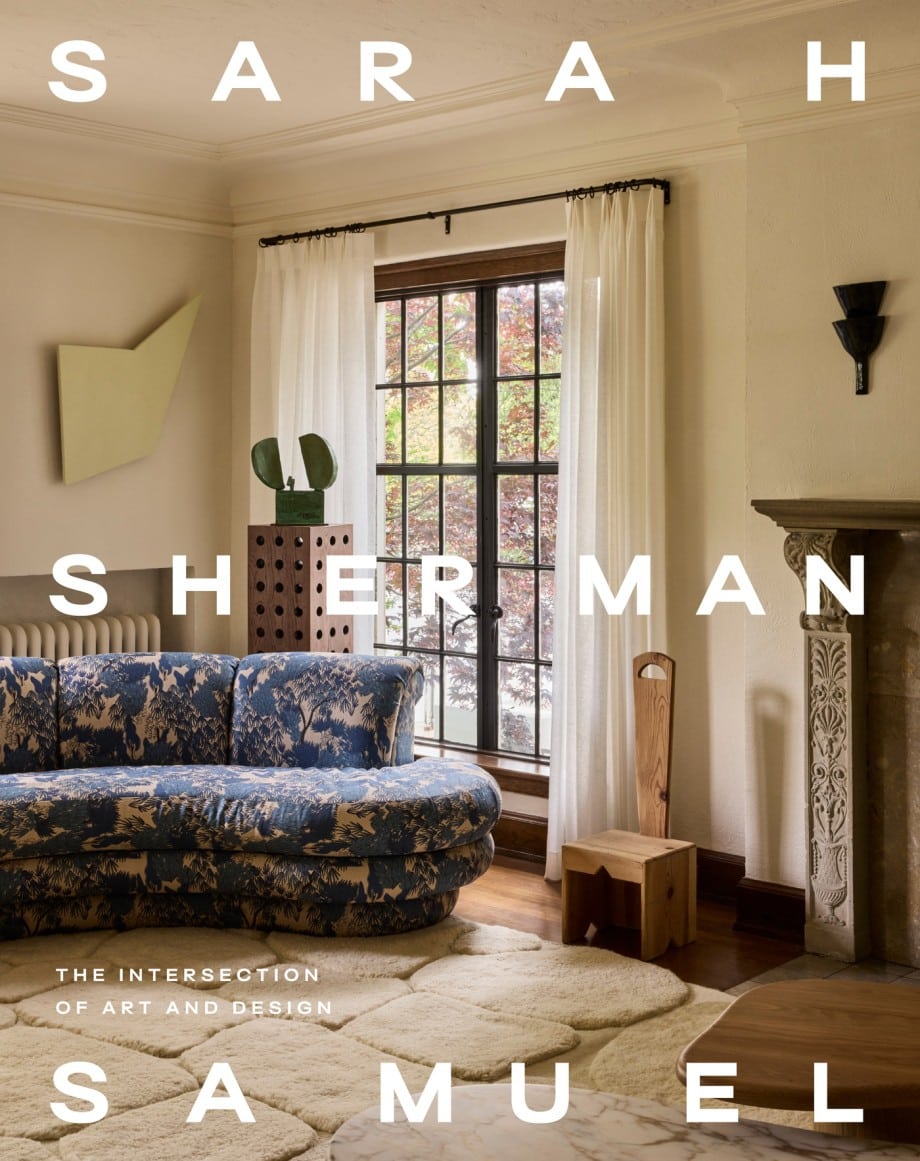
 Oh Hi! I’m about a year-ish backlogged here on the blog and while I have been keeping up to date on IG, you know the blog essentially serves as the resource page for projects where I can get more in depth and I’ve been meaning to share all the goodness from my project for the lovely Garance Doré since the spring! It was the cover story for Domino and it came out while I was


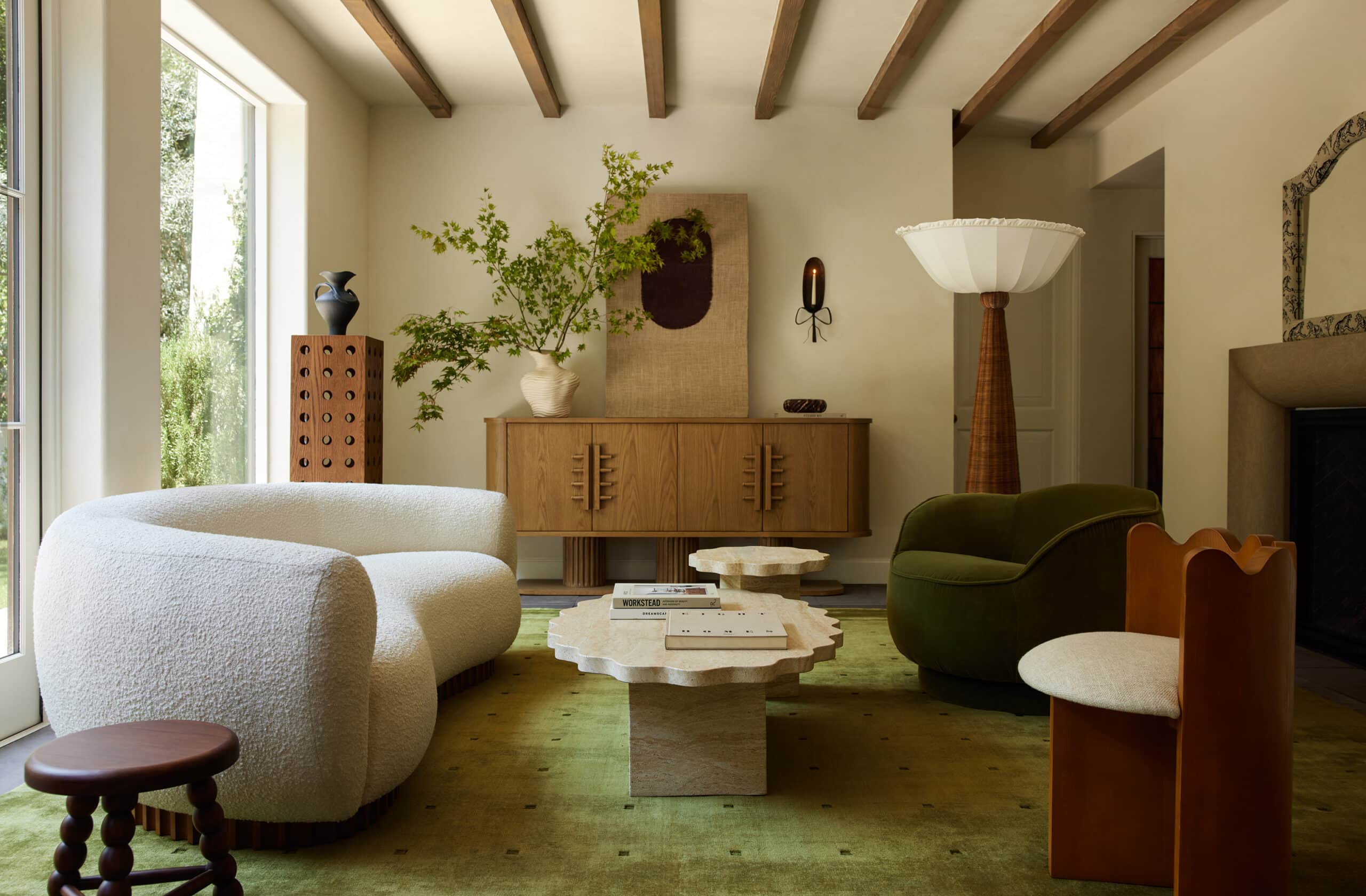
 The main living space is essentially one large open concept. It was pretty open when Garance purchased the home but the kitchen had dark cabinetry and there was a tiny window in the kitchen that didn’t bring in much light. There was also a wall that divided one sitting room from another in an attempt to easily differentiate the space but what it did instead was cut the one living space off from the rest of the house as well as block the view to the outside from the other living space and kitchen area. The room simply went unused. So with the addition of a few strategic built-ins, moving of the fireplace, and tearing down the wall, the space was unified. I then used rugs and low seating to create designated conversation areas which divides up the space without blocking any of the views outside. In the kitchen I used my signature line of cabinet doors for SemiHandmade, Caesarstone countertops and Concrete Collaborative cement tile to create the all white kitchen where textures subtle patterns in each material bring the visual interest.

 In the guest bedroom and the guest bathroom Garance wanted to go bold and I happily obliged. With pattern play and a statement color. We demoed out most of the bathroom but kept re-used the existing bathtub and toilet while giving it a major facelift with a new surround and tile work.

 In the entry I commissioned a custom console table from Hedgehouse furniture based off of one of their cabinet designs which sits across the two Britt Merrick for H Merrick surf boards. The half moon shape of the mirror is repeated in my sss x park studio “half moon” hardware on the drawers.


 In Garance’s master bedroom she wanted it as dark as possible for ultimate sleep, so dark we went… and monochromatic. The moody hue is perfect for her “sleeping den”. In the master bathroom the opposite was needed. It was already a dark cave and Garance wanted all the natural light so we busted down walls, opened up the space and breathed new life with white fireclay brick tile, a custom vanity, and a huge oversized mirror.
All of the stunning photos above were taken by Jason Frank Rothenberg for Domino Magazine and Styled by Rosy Fridman. I made a trip back to Garance’s to shoot more angles of the house and will be sharing those photos along with all the details and before & after’s in more posts later this week so see you back here soon! x
Photos by Jason Frank Rothenberg, for Domino
Design by Sarah Sherman Samuel
Story Produced by Kate Berry
Styled by Rosy Fridman
Branding and Initial Web Design
Nature
Web Design Production
Jane Reaction
Site Development
Alchemy + Aim

Absolutely stunning! Can’t wait to hear alllll the details!
Source for that beautiful dining table with the tambour base please!!!!
Great work!
[…] >>> Sarah Sherman Samuel […]
Hi Amazing transformation. where is these black graphic bed headboardand this sitting corner in the kitchen,is it diy? can you share more information? it loooks amazing. thanks alot.
[…] in kitchens. I have used them countless times in my own kitchens and in clients homes (here, here and here are just a few examples). Utilizing SemiHandmade with Ikea gives you the opportunity to […]
Will you please give me the specs for the Master bath? Color and maker?
Looking for a nice neutral tile for my Mid-century modern kitchen remodel on Portland, Oregon.
Fabulous information! Thank You!!
I love this bathroom, I AM LOOKING FOR A SIMILAR VANITY, i WOULD LOVE TO KNOW WHERE TO GET IT, THANK YOU!
Hi Andrea, This was custom. here are a few similar:
https://bit.ly/47l7DYM
https://bit.ly/3ONwEEw
https://bit.ly/47mjc1O