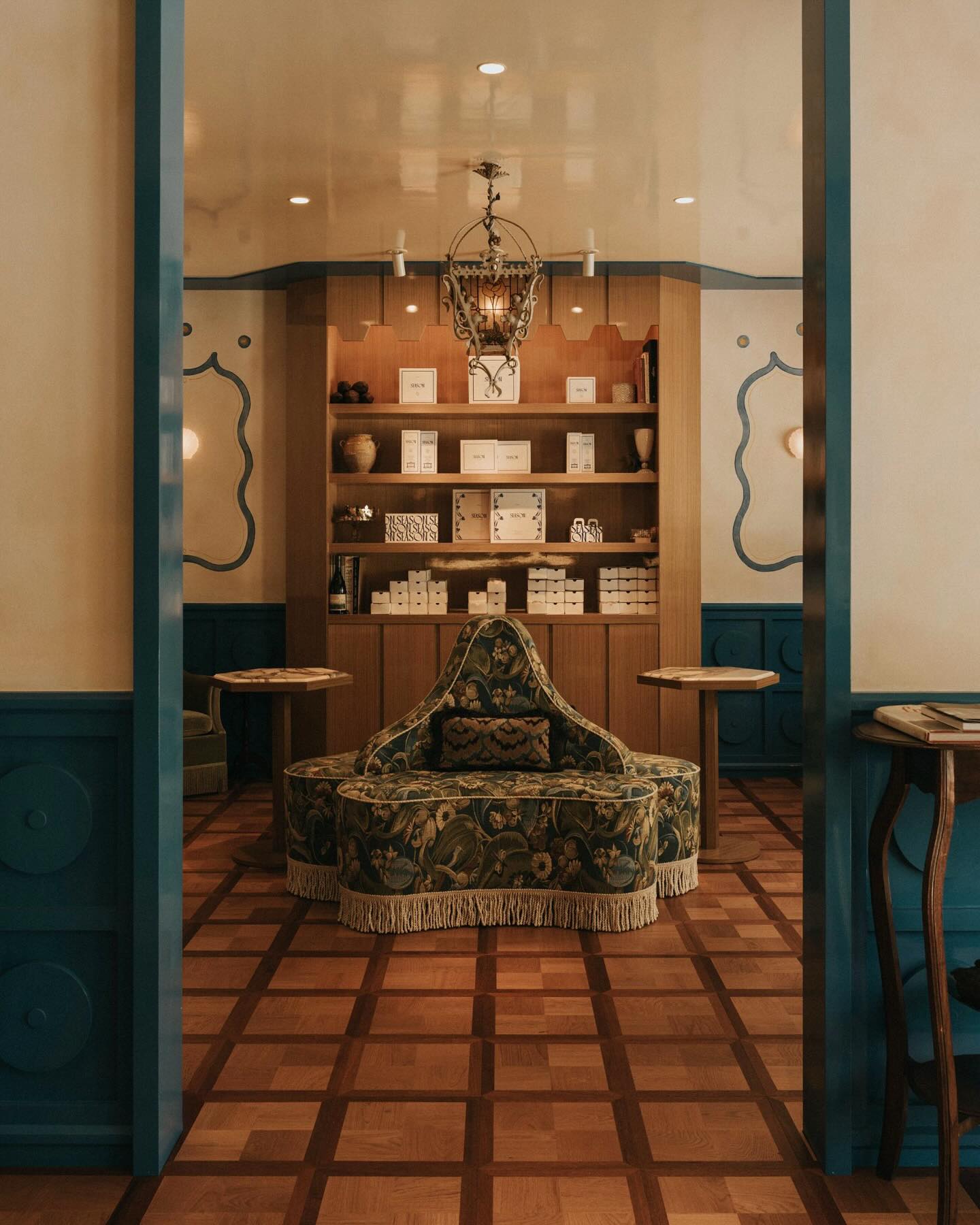
Have you guys heard?! Mandy Moore started her own production company and we are taking her new offices at Paramount Studios from dreary corporate to a creative space that we will all want to hang in. We had so much fun designing her house, so I was thrilled to work together again on her latest venture. Also, workspaces happen to be a favorite of mine to design and have I mentioned Mandy is a dream client to work with?

We are SO close to the full reveal, but in the meantime, I’m taking you on a little behind the scenes of the design process and sharing some tips to getting that high end look on a more high/low budget as well as how to make a big difference without renovating for all you renters out there.
Being a new company, Mandy doesn’t know how long they will be in the current space, there is always the chance she could outgrow it or not, it is all very new. So, while she wanted it to be a reflection of her and an incredible space to be in, she also wanted to do it cost effectively. The plan was to Invest in some pieces that she could take with her if they move while also finding affordable options that make a big impact for the current space. The result is a unique mix of high and low, color play, layered patterns, vintage details and rich textures and I turned to sources like Amazon Home to make it happen.
Let’s take a peek into what the offices looked like with the existing furniture she inherited.
BEFORE


As you can tell my littlest assistant is underwhelmed by the space.


So, I had my work cut out for me. We started with the functionality, how they were going to use it and what their needs were. One part I love about designing offices is that the marriage of form and function is extra important. Once that was all nailed down, it was time to shop and I began pulling pieces together for the two individual rooms.
Since the office space was located on the Paramount lot (Mandy is renting the space) we weren’t able to modify the building (nor did we intend to… at one time it was part of Lucille Ball’s dressing room!) the flooring had to remain the same, but you better believe wallpaper and large rugs were saving graces to transform the offices. Which takes me to tip #1: If you don’t have the budget to renovate, or are renting a space making it not an option, buy the largest area rug you can to cover unsightly floors. It’s the quickest way to an instant makeover. This tonal rug is a dream.
OFFICE 1 PLAN

I knew we wanted to go a bit bolder in Mandy’s office than we did at her home (another fun perk about workspaces). We still incorporated a lot of the same color palette, but in a totally different way.
Tip #2: If you have trouble settling on a color palette or combining different colors yourself, find an inspiration piece. It could be a piece of art, a photograph, a pillow, wallpaper, a rug. Really anything that already has a color palette you are drawn to. The bold wallpaper was a great jumping off point for the palette in this room and the clean lines and geometric shapes of the pieces I found on Amazon like the sofa, lamp, rug, and coffee table help to create the modern but warm mix I’m always after.

Which takes me to tip #3. Cut the noise by refining your style.
If you are easily overwhelmed by options, Amazon has a shopping tool called “discover your style,” (available at www.amazon.com/discover) which is a visual way to shop that lets you filter looks by simply clicking ‘Like’ (thumbs up) or ‘Dislike’ (thumbs down) for instant recommendations. It makes it easy to shop for home décor within your own style, on their site of a bazillion choices. An edited space always wins.
Tip #4: Customize furniture from traditional retailers pieces for a more bespoke look.
I never shy away from a good old-fashioned hack. Putting your own spin on something that makes it fit into your space can save time and money! Originally, I was planning to make a custom banquette, but then I found the pink sofa in the perfect color and material on Amazon from their Now House by Jonathan Adler line– it ticked all the boxes. To make it into a banquette (so it would be desk chair height) I just removed the legs and built up the base a few inches higher to create a cozy workspace or spot for Mandy to eat lunch when paired with a small bistro table. You can see a glimpse of the result in the first photo.
OFFICE 2 PLAN

In the second office, the color palette is a little more subdued, but we went for higher contrast with black & white and layered on the patterns for visual interest.
Tip #5: Textures and Patterns can make a space. People can easily shy away from patterns because it can feel hard to navigate those waters, but subtle patterns and textures bring complexity to a space that makes it feel more special and considered, aka high end. If you like patterns but aren’t sure how to incorporate them in a space… add a stripe. Stripes are possibly the most versatile pattern and easily complement other patterns for that layered look. Mixing in different scales of stripes can even work. In the office, we put a stripe on the ceiling as well as on the coffee table AND (if you’ve been following along here or on my Instagram, you might be privy to the fact that I just launched my own rug line!) Mandy was the first one to get one of my striped rugs which has landed on the floor of this office.
Tip #6 mix in the vintage. Do I even have to tell you that? It is a sure-fire way to further elevate all the new pieces you bring in. In both of the offices, we mixed in some vintage accents like the coffee table and chair above and then rounded it out with items from the “Now House by Jonathan Adler” collection and “Rivet” collection on Amazon. I’ve been a Jonathan Adler fan for as long as I can remember, and his Now House by Jonathan Adler line clearly did not disappoint.
The ladies were ready to get the office up and running, so it was a no-brainer that Amazon Prime saved the day in getting pieces there quickly, even large pieces like furniture. And while we are waiting on just a few final touches, here’s one last peek of some of the finished details that have made their way into the space.

I’m still not over how stunning that rug and coffee table combo is.
This post was sponsored by Amazon Home, shop the pieces I am bringing into Mandy’s office!
Now House by Jonathan Adler Josef Cocktail Table // Vally Sofa // Matrix Collection Area Rug // Tall Cloud Vase // Otto Pedestal Table // Rivet Wall Sconces // Rivet Metal Side Table // Rivet Lamps (I loved these so much I used them in two colors!)
Photos by Tessa Neustadt

The wallpape is incredible! Where can I find it?
[…] Moore just started her own production company and the office space she leased at Paramount Studios was a little sad (if you missed my first post, […]
Breath-taking one!! Keep up the Good work
Love the wall paper too… and where did you get the couch, looks fluffy
hi Victoria, that sofa is no longer available. here is something similar: https://bit.ly/410N7tG