 She gone! Goodbye small old kitchen with zero counter space! Construction has officially started (FINALLY) and while I am still playing catch up in the design. Yes, I broke my cardinal rule (again) of not starting construction until after the design is finished and materials are on site, but we couldn’t wait any longer. We’ve been a bit swamped between the kids, and work, client projects, the move, and our second move (into a rental house during construction) etc etc and that left very little time to work on our own house, it ended up coming last but we finally got some help with the kiddos and I’m wrapping up some things, so now it’s my turn! I hope you’re as ready as I am for me to start sharing progress and process as we go! Thankfully I pretty much designed the whole kitchen before we even saw the house in person, so I am starting there! See my initial plans to get all caught up here.
 Earlier this month I took a trip down to Louisville, Kentucky to dive deep into all things Café Appliances. We got to see them installed in a few homes, we toured the factory, got a taste of Louisville (and the bourbon), did some mixed metal jewelry making and created real-life inspiration boards around the spaces that each of us will be creating with the Café Appliances. It was so fun to see how different everyone’s boards turned out based on their own personal style. That’s mine above!
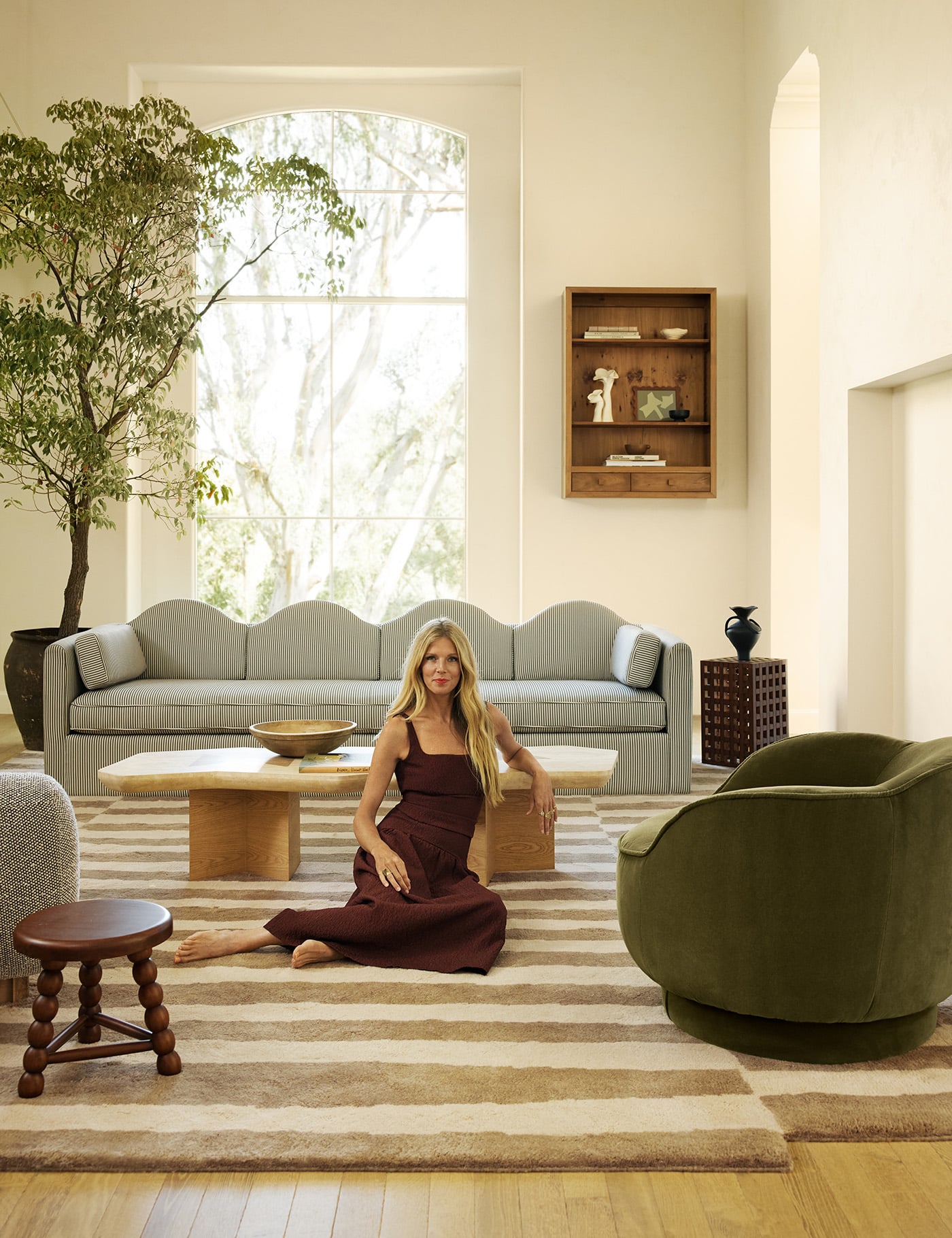
Speaking of personal style… I like to reference client’s wardrobes when designing for them because what you choose to put on your body is such a great reflection of your style and I feel like your home should reflect that just as much! So for my own space I turned to my wardrobe…
 and noticed a whole lot of whites, ivories, natural materials, combining different textures and always a touch of gold with my jewelry.
When it came to overall design of the kitchen, I wanted it to be similar, bright, natural, open, a reflection of me, and feel like part of the living space. Crazy but true…I never thought I would want an all white kitchen for myself. I usually gravitate towards colored cabinets but in this space I wanted the wood ceiling (the only original feature in this room that we are keeping) to be a main focal point. See the before photos here, but previously the kitchen had a lot of wood, A LOT. Wood floors, wood ceiling and wood cabinets. I am a big fan of natural wood but if you’ve been following me for a while you know I like a bright space and since the wood ceiling was so special that meant I wanted to remove the other wood finishes to really let it shine.


 When I looked at my clothes, other parts of the house, my products, the finishes and appliances I knew I wanted to use, a color (or lack there of) palette started to come together. Thankfully Café Appliances gets that you want your house to be a reflection of you and it doesn’t have to stop at the appliances. There is so much stainless steel out there and not much else, so it’s incredibly refreshing to be able to find customizable appliances to fit my or a client’s style.
And finally, I took all that inspiration above along with some sourcing leg work and translated it into the product selects and finishes for our kitchen.
 Wood, terrazzo, quartz, brass, cement… and a lot of love. A lot of love for all the things. 🙂 Are you as surprised as me that I am doing all white or do you think “duh this is totally you”? The key to making all white not boring is to play up all the textures and of course the pop of metallic really helps. Wish me luck!
Sources for first photo: Sweater by Entire World // Jeans from Asos // Table from CB2 // Chair from CB2 // Gold Initial Necklace from Maya Brenner // Gold rings from L Frank Jewelry
Sources for second photo: Sweater from Club Monaco // Top from Sugar Candy Mountain // Jeans from Topshop // Gold rings from L Frank Jewelry
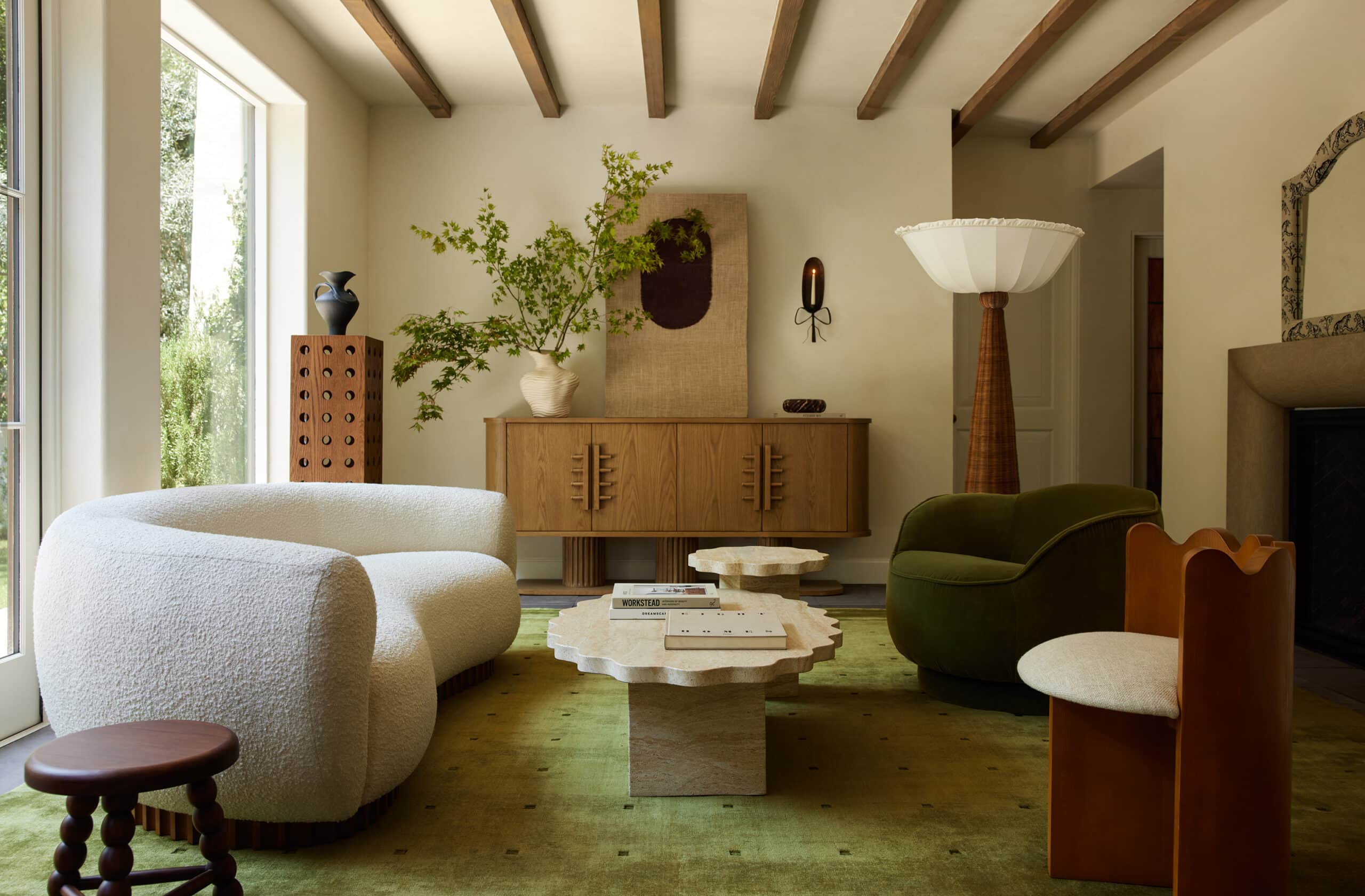
Sources from living room photo: Rug is vintage // Ottoman by sarah sherman samuel // coffee table from Urban Outfitters // rug is vintage // chair is vintage // Art from Minted // stool from lulu and georgia // vase is from CB2 // Planter from CB2 // Pillow form Kesslyr Dean
Kitchen Sources: Range from Café Appliances // Dishwasher from Café Appliances // Refrigerator from Café Appliances // Fresh Concrete countertop by Caesarstone // White Cabinets by Sarah Sherman Samuel for SemiHandmade // Brass hardware by Sarah Sherman Samuel for Park Studio // Faucet by Kallista // Stool from The Citizenry // Pendant Light from Allied Maker // Quartz Sink by Elkay // Cement Tile by Granada Tile

i’m so excited to see how this all comes together! will you be doing poured terrazzo or tiles? if tiles, i’d be very interested to see where you source them (the sample looks like concrete collaborative?) i’m doing this for my kitchen reno and don’t know what size tile to order of if we should do brass grout lines / inlay. xo
Such a pretty mood board. I love all of the texture and I am surprised at how much I like the ceiling with it. Can’t wait to watch it take shape!
Thank you! I’ve totally fallen in love with the ceiling exactly as it is. If I was to even change the wood tone I think it would ruin it and then I would end up just painting it white which would be so sad. pretty but a little sad and def not as special 😉 haha
They will be large tiles 4 foot tiles.
These finishes are gorgeous, I can’t wait to see you bring it all together. I’ve been going through withdrawal since things wrapped on Mandy Moore’s house, so this renovation is exactly what I need right now!
thank you!
That is really rad that you took inspiration from your wardrobe but I hope a designer never does that for me, because my wardrobe is basically yoga pants and sweatshirts or hoodies. However, for my home, I like luxe finishes, jewel tones, and maximalism. Totally different!
Haha well I’d be willing to bet there is one piece in your wardrobe that reflects your style, a favorite piece of jewelry or what you’d wear out for the evening. Maybe it just doesn’t reflect your whoollle wardrobe but I’d recommend they would work the yoga pant in there too 😉
Can you share your gold boot source please?
They are by Sam edelman. I got them in shop bop. X
UGH! this is beautiful! Absolutely cannot wait to see this come together. xo
thank you. me too! haha
Agh! Gorgeous!! I recently ordered the entire cafe kitchen set!
Obsessed with how beautiful it is and really hoping the lead time is not as heinous as so many reviewers have stated 😳. Did you happen to find a paint color that jibes with the appliances? I’m totally torn bc I have a ton of wood and that’s pretty much all of the color I’ll have besides the vein in my marble counters… Whites are so tough!!
I’m working on the paint color right now! WIll report back
Maybe you’ve liked color in a kitchen in your other homes, but white is perfect for this one! Can’t wait to see more of your beautiful renovations on your home : )
Thank you! Yes with the wood ceilings I want allllll the white.
HI, wondering where the simple wooden stand that is holding up the CB2 planter is from?thanks!!!
Hi, where is the wooden planter table from that is holding the CB2 planter? thanks!!!
Hi! I love the terazo? Is that what the speckled surface is called? Is that for counters?
[…] appliances and warm bronze appliance hardware (has there ever been a more me color palette? See the inspiration here). I ruminated over the details for months (pretty sure we used the kitchen without cabinet hardware […]