 Well ‘knock on wood’, we found a new contractor! I am not sure why it has been so hard to track someone down for this project but I hope you guys have been bearing with me while we get all that sorted out. I don’t remember if I shared, but we need a new roof, and when you’re talking about a new A-frame roof, it is kind of a big deal and kind of a huge expense we didn’t plan for and kind of a GIANT pain in the arse. So we have been getting quotes on that all while our kitchen is still torn down to the studs, the roof has been leaking all over the new tile (so glad we didn’t put in hardwood!), there is some serious stank sewage back-up, apparently Mickey Mouse did our electrical and the air conditioning isn’t working (not ideal when it is 110 degrees outside). But on the bright side our gorgeous sofa from Arhaus has been delivered and it did not disappoint. Nope, not even a little bit.
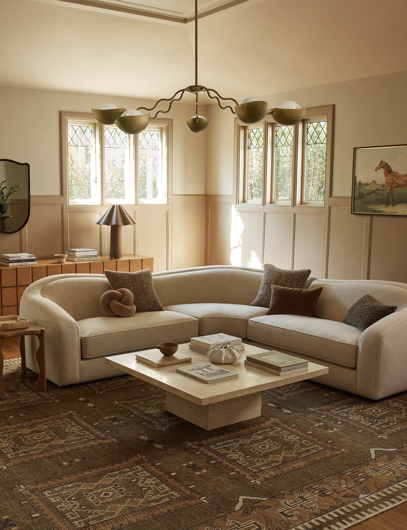
Rupe and I hightailed to the a-frame to see the delivery, unwrapped it, took a quit sit, high-fived, snapped these pics and then wrapped it right back up so all the upcoming construction dust doesn’t soil the snow whiteness of it all. It is hard to tell in the photos but the sofa is really big, like 9 feet long big and 4o” deep. The Remington sofa comes in 4 different length options and since the space is so long naturally I went for the widest. Other customizable options are the depth, the cushion count, the wood finish on the legs (I am having a real blonde wood moment, and not a ditsy kind, I just really am loving blonde wood), and it comes in 11 different Belgian-linen options (I chose the white because I wanted to break up all the stonework). The sofa sets a pretty perfect foundation for the low loungey vibe I want to happen in here eventually


 OH and I almost forgot to tell you my rug drama! Remember when I shared my design process and how I look at the sofa and rug pairing first and how that rug was one of the only things I had decided thus far? Well it arrived at my doorstep and I unwrapped it only to find what they were calling “charcoal” looked more like BROWN and more brown. I bought it off of etsy and while I was thinking I was getting the exact rug from the listing photos, they thought any rug that had those stripes would do. And while the brown wasn’t bad at all on its own, when paired with the brown stones in the room, it would all be too much… brown. I needed an actual charcoal color to cool things down and give it some contrast.
So I searched high and low for another kilim that was large enough (10′ x 13′) and came up empty. Instead I found this smaller rug, that I loved, on ebay and layered it on a larger (and less expensive) black and white striped rug to get the size and look I wanted. I love how it turned out and the two patterns give it a little extra dimension.
 You might recognize the coffee table from our L.A. living room (before we baby-proofed). It is actually too small for the space here, but we brought it over to sit at the foot of one of the beds, eventually, and it’s what I had on hand at the moment. So far the a-frame has served as a really cool storage facility for the few pieces of furniture we have started to accumulate for the space. I dream of the day we actually get to spend nights here. Until then, I think I’ll camp out on the sofa, wrapped in plastic or not.
Check out more on my design process for the living room here.
See all the progress (or lack there of) on the A-frame (including before photos) here.
Sources: Sofa by Arhaus // Coffee table is vintage // Chair is Vintage // Side Table by Lulu & Georgia // Large Rug // Paint Color is Polar Bear by Behr

Stunning – love that room. It looks amazing!
Stunning as usual. The white ceiling is looking so good!
What a beautiful space! I’m in love with that rug!
http://www.thebeautydojo.com
Hi Sarah –
I’m glad you were able to find the rug you needed from us. Please don’t hesitate to let us know if you need anything!
– Matt
eSaleRugs Social Media Team
Positively dying over that armchair. Is that what it actually looks like or is it a chair stripped of fabric and padding and just left with the skeleton?
The living room looks great. I remember seeing the initial photos when you first bought the a-frame, wondering how on earth you would make that look awesome. I had no doubt you would, was just wondering what you would do to make that stone work. Well, it looks amazing. Crazy jealous. 🙂
[…] thing I like about Arhaus (you may remember I got one of their sofa’s for the A-frame) is that they don’t represent just one aesthetic. It is mix of many different styles, so my […]
[…] also might see we have a different sofa from what I originally had chosen. Unfortunately during the year of renovating, stopping and starting while we found different […]