Many of my favorite bathrooms have tiled floors AND walls and since I love that look I thought I’d share what I look for in a good tile pairing. It’s essentially just like mixing patterns in your wardrobe, which I can never get enough of, and it’s even better when bringing it into the home.
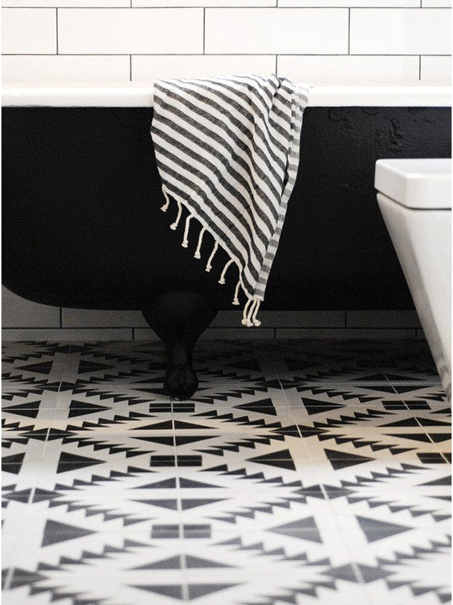 My number one trick is to create balance with one small scale pattern and one large scale pattern. For example, if you have a detailed tile pattern with smaller shapes on the floor, choose a larger scale, simple tile (with no pattern) on the wall so it doesn’t compete with the floor. This bathroom by Capree Kimball illustrates it perfectly with the bold pattern on the floor and large subway tiles on the walls (see more of her bathroom here).
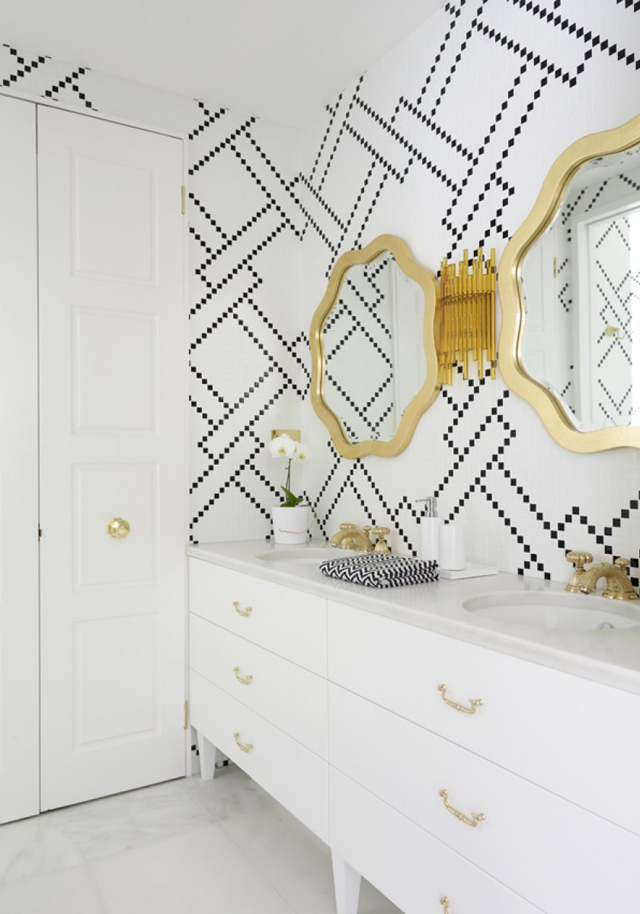 Try using a natural stone as a neutral pattern. In this bathroom, the wall commands all of the attention. Although they are small scale tiles, they make up a large graphic print and you wouldn’t want anything to fight with that. By using large marble tiles on the floor there is visual interest down there, giving it a rich layered look, but it reads as a neutral. The subtle irregular pattern on the marble is beautifully juxtaposed with the bold graphic pattern on the wall.
This bathroom is by Greg Natale, see more of his work here.
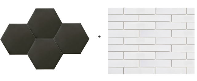
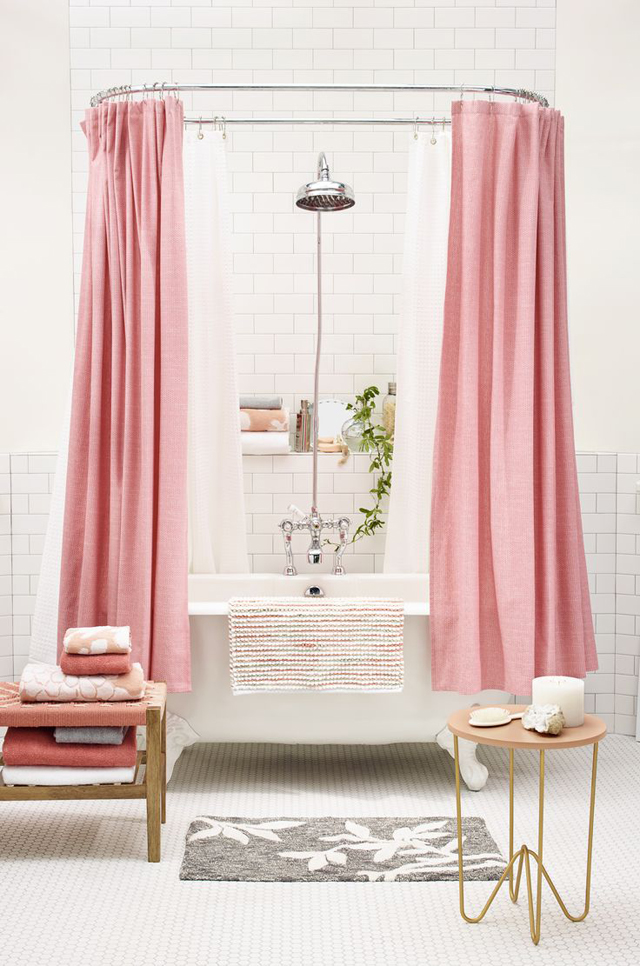 A fool proof way to combining two tiles is to stick with the same color for both the floor and the wall, and only switch up the scale. You might remember that we did this in our last bathroom. This also reinforces my first tip where the scale of the floor tile is significantly smaller and more intricate than the scale of the wall tile and this way there’s no battling for attention. Each plane has it’s own pattern and they live happily next to each other.
Image from Target
To catch you up on what is happening in said bathroom… last week I shared the beginning stages and plans for our remodel. Basically, everything was demoed and hauled out, an insanely messy job that I was a little sad I could be no part of this time around (growing a baby and construction dust probably don’t go so well together), and now the new tub is in place and the tile is going in!
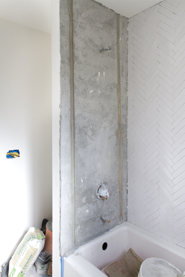
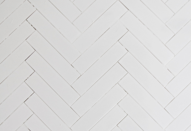
 It isn’t much to look at yet, with no grout and the bathroom in shambles. BUT, the old shower is gone, they rebuilt that wall (pushing it back to make room for the larger bath and flipped around the shower head to empty into the tub), and you get the first look at how I’m laying out the tile in a herringbone pattern on the walls to compliment the large hexagons that will go on the floor. A whole new bathroom is just around the corner, eek (I HOPE)!!
To see the bathroom before check here.
To see all of the home renovation posts check here.
Product sources: White Retro Subway Tile from Wayfair // Black Hexagon Floor Tile from Wayfair // Kohler Bathtub from Wayfair

I like the herringbone pattern on the wall! I also like how Wayfair tells you how many cartons of tiles you’ll need per square-footage. Super helpful! I’m excited to see the finish product, but of course looking forward to more progress posts!
great tips! love those matte tiles.
Loving this already. Can’t wait to see the finished product.
This post is the best timing. I’m redoing a bathroom and having a hard time getting the tile on floor and walls to harmonize! I am leaning towards a 4 inch hex on the floor with 12×24 shower walls, both in a marble scheme, grey or white grout. Thoughts? Love your blog!
[…] big on tile in bathrooms and here’s 4 tips for getting the mix of styles […]
Thanks Ginet! Yes it was super handy. Especially with the hexagons. There is quite the algebraic formula to try and figure out how much square footage hexagons cover. ha
Hi Caroline, What you have in mind sounds beautiful! I would lean towards a light grey. You can pull a color to match one of the marble strands. White grout would be nice and bright but we had white grout in our last house on the master bath floor and it got SO dirty around the sink. It looked terrible. There are grout bleaches and cleaners and what not but if you go grey you don’t even have to think about that which is really nice.
[…] Bathroom tiling tips […]
I am definitely a fan of the black and white. It is a very elegant look.
Great tips! I definitely agree that when dealing with two different tiles, it is very important to stick with the same color. I also love the herringbone pattern you are doing! Very creative. Thanks for sharing!
[…] “Try using neutral stone as a neutral pattern” and more tips for pairing floor and wall tiles. […]
Love your work, Sarah! How did you finish/trim the edges of the herringbone pattern on the front sides of the shower?
Hi Deena,
I had them use a piece of metal (kind of like a corner bead for drywall, but not as big of an L. sorry I don’t know what it is called) that made a little lip which extended out just as far as the tile is thick from wall. So the tile butted up to that and I had the painters paint it the same color as the wall so it is seamless.
It’s probably a Schluter strip. They make a number of different profiles, but Jolly is the most common one for finishing off the edges of wall tile
http://www.schluter.com/schluter-us/en_US/Profiles/For-Walls/Edging-&-Outside-Wall-Corners/Schluter%C2%AE-JOLLY/p/JOLLYv
[…] için kaynak siteleri: 1, 2, 3, 4, […]
I love that getting wall tiles in your bathroom gives you the chance to be creative. The tile pattern that you chose to with in your photograph is gorgeous. I would love to get the chance to add a unique tile design to my wall.
[…] 1 | 2 | 3 | 4 | 5 | 6 | 7 | 8 | 9 | 10 | 11 | 12 | 13 | 14 | […]
oh, What a great timing post. I was thinking about it and now I get it from your post. Actually, your shower matte is really impressive. But one thing I couldn’t clear. What kind of curtain I will use in the bathroom. Can you share your opinion please.
can I use one of your photos? thanks
Somehow I really enjoy reading your blog posts. And this was no exception.
Since I will have to do my bathroom renovation, this was very useful. Thanks
Very good post. Thanks for sharing.
I agree!
Good tips! I love the design of the tiles. Its amazing.
You had to mention grout color and patterns created by proper tiles. Octa shaped tiles (dark one, for example) with light grout will make an interesting design perspective. As well as combining white/light tiles with dark grout (more usual trend – just look at subway tiles)
[…] pattern mixing and it’s most subtle and finest (see my tips on tile pairings/pattern mixing here) and, I know I say this every single time, but I really can’t wait to see it all come to […]
[…] pattern mixing and it’s most subtle and finest (see my tips on tile pairings/pattern mixing here) and, I know I say this every single time, but I really can’t wait to see it all come to […]
Take the confusion out of choosing an appealing design with Freesumes! Download, Edit and Email or Print.
Haven’t seen a black bathtub yet, but it looks great!
What size grout lines did you do for the herringbone? Love it!
[…] project. Sarah Sherman Samuel is a Los Angeles based Interior and Product Designer. She writes “It’s essentially just like mixing patterns in your wardrobe, which I can never get enough of, and it’s even better when bringing it into the […]
Your blog is amazing it gives so much ideas on how to beautify our bathrooms.
The tile pattern that you chose to with in your photograph is gorgeous. I would love to get the chance to add a unique tile design to my wall.
Thank you for these insightful tips on tile pairing! I especially appreciate the advice on balancing small and large-scale patterns—it’s a great way to add visual interest without overwhelming the space. The idea of using natural stone as a neutral pattern is also brilliant; it adds texture and depth subtly. Your guidance makes the process of selecting tiles feel much more approachable. Looking forward to applying these principles in my own bathroom renovation!
Visit Our website : https://browndoghomeremodel.com/