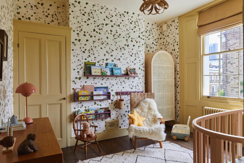
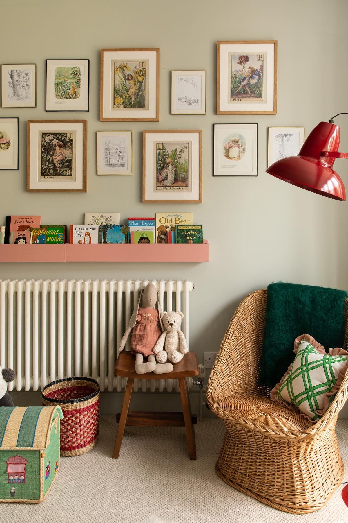
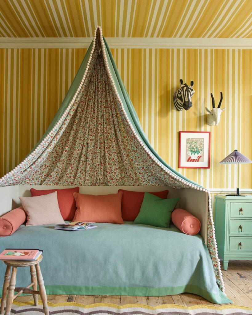
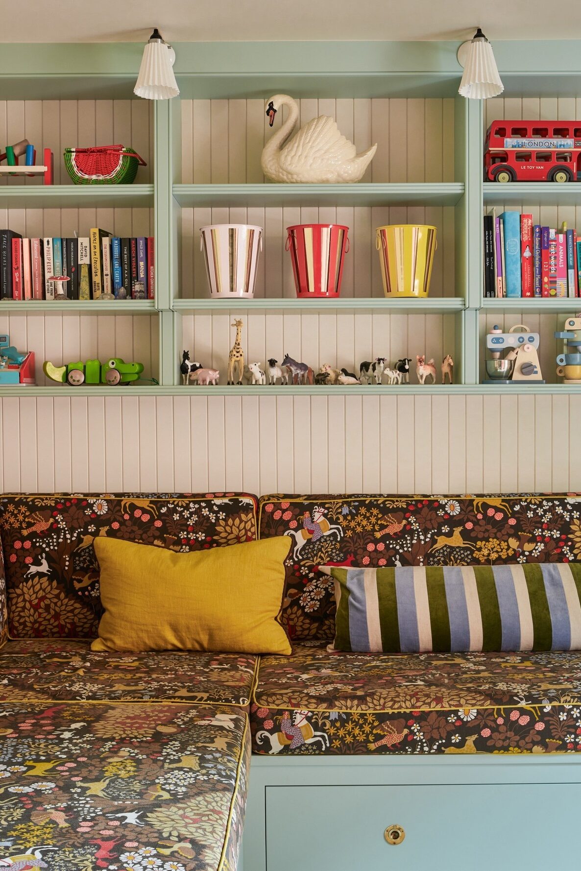
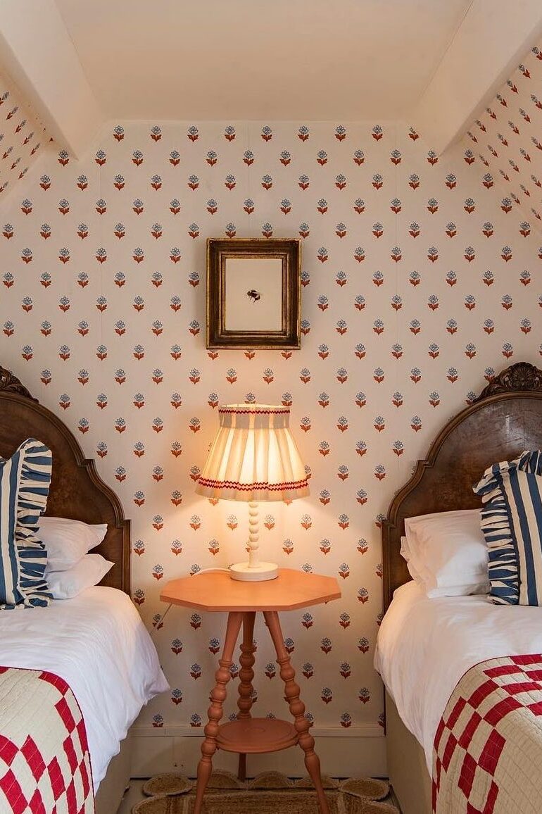
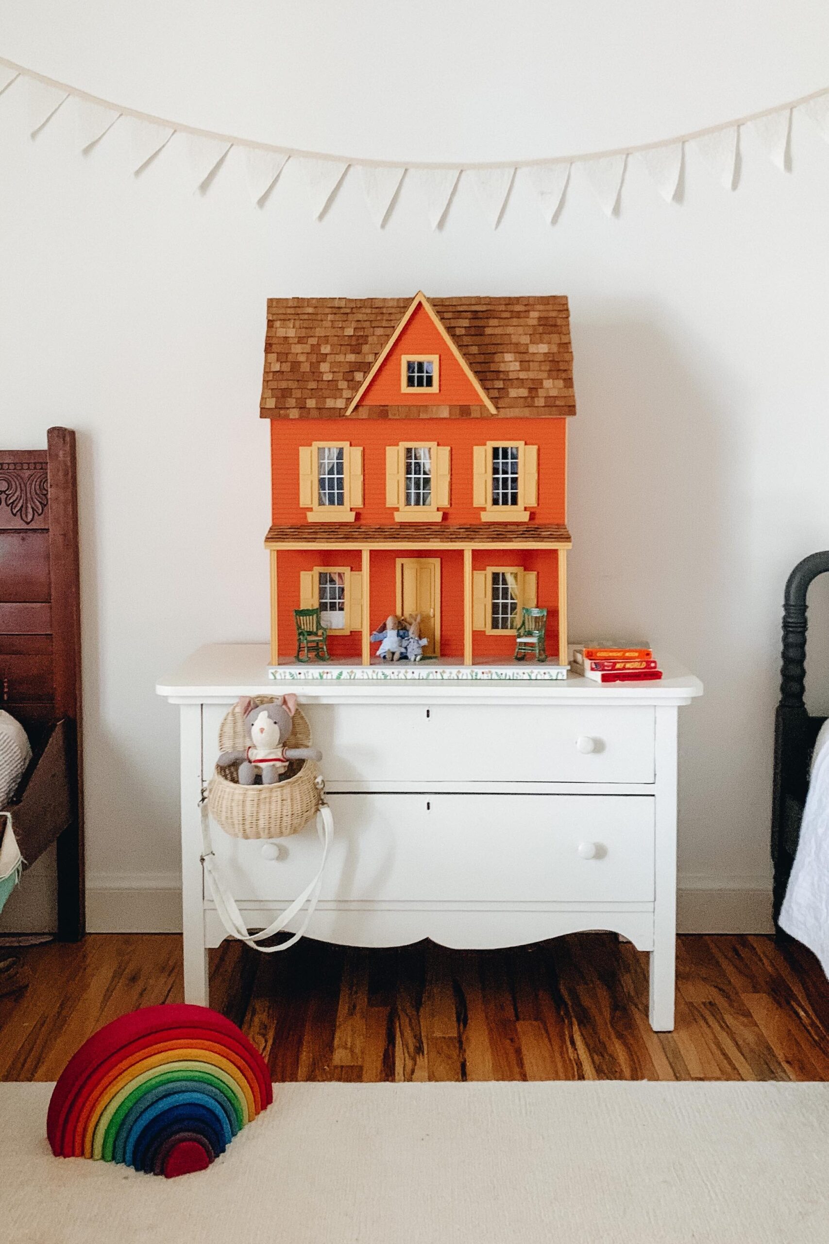
Rooms and spaces for the kiddos are a favorite to design. The best place to mix patterns, be bold with color, and play with scale.
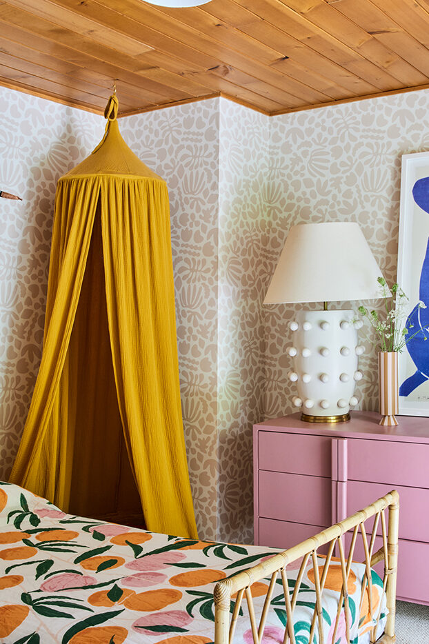
Remember Clover’s room? So many fun layered patterns. I went bold with blue artwork and the dresser… that perfect pink! Still one of my favorite dressers. And even though the room was small, I played with scale with the large dresser, an extra large print, and the oversized lamp. The canopy, the floor-to-ceiling drapery, and the shelves on the opposite side of the room balance out the space.
My inspiration folder of kids’ rooms is overflowing, so sharing with you some favorites below.
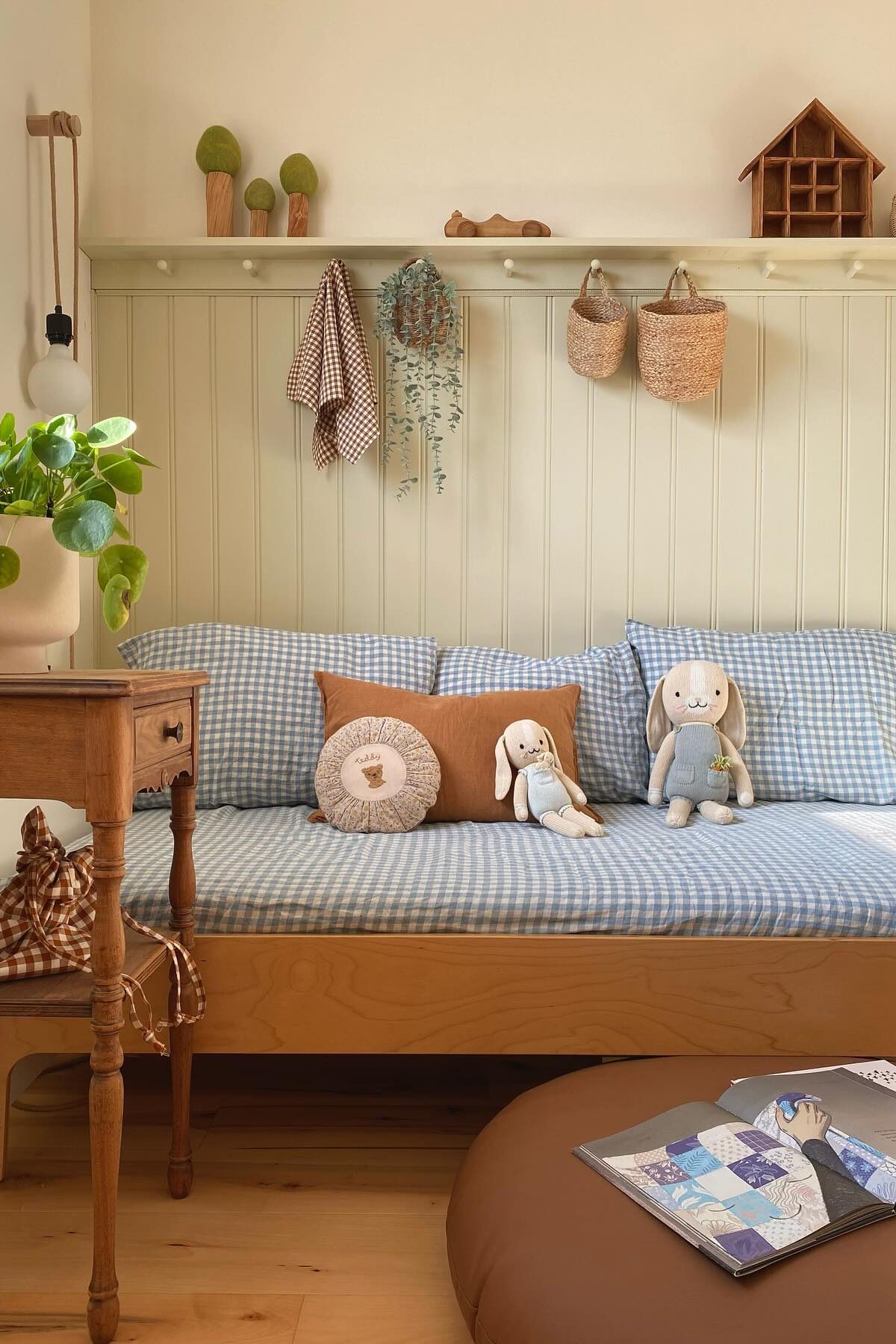
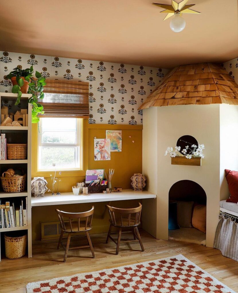
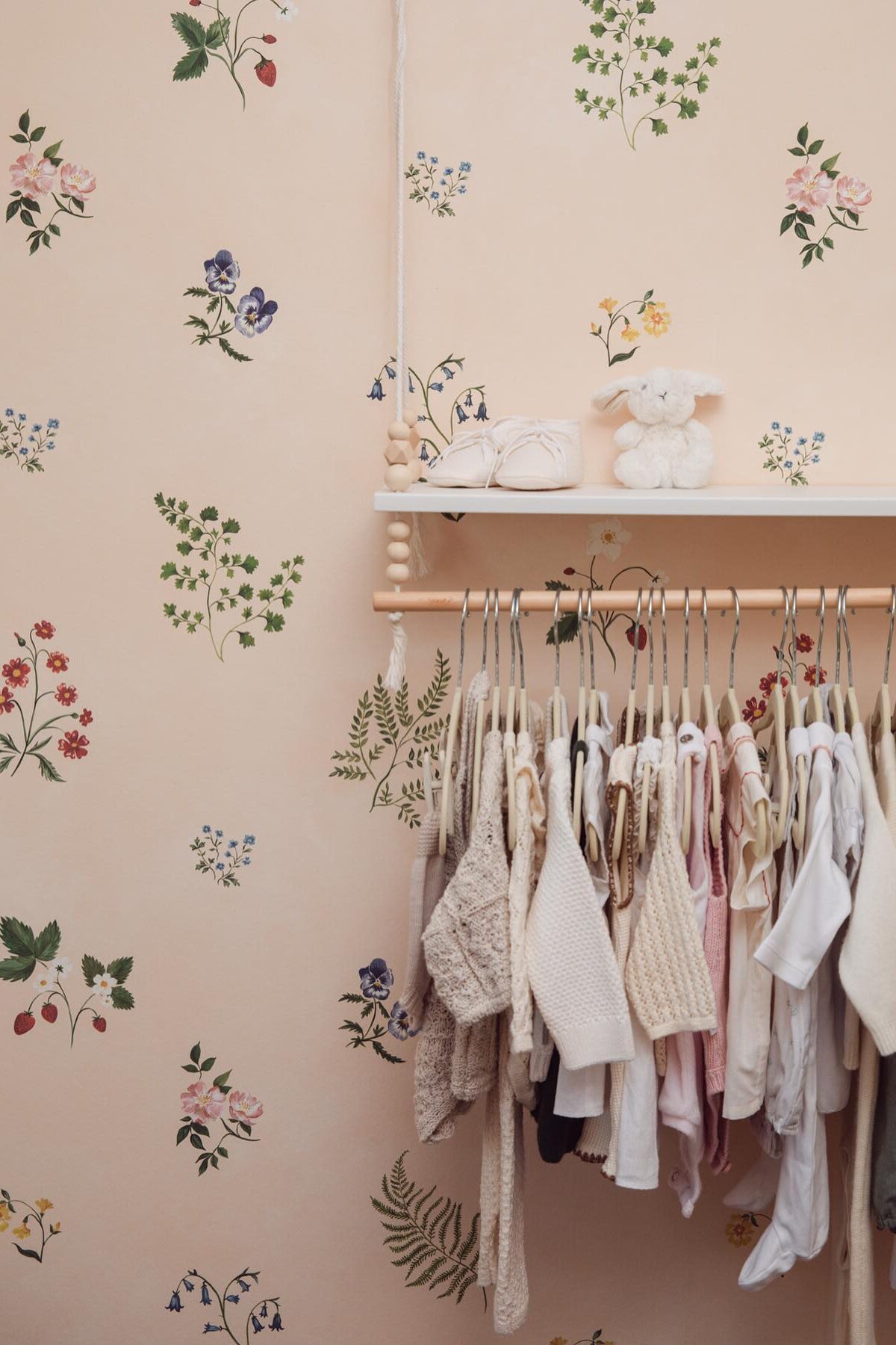
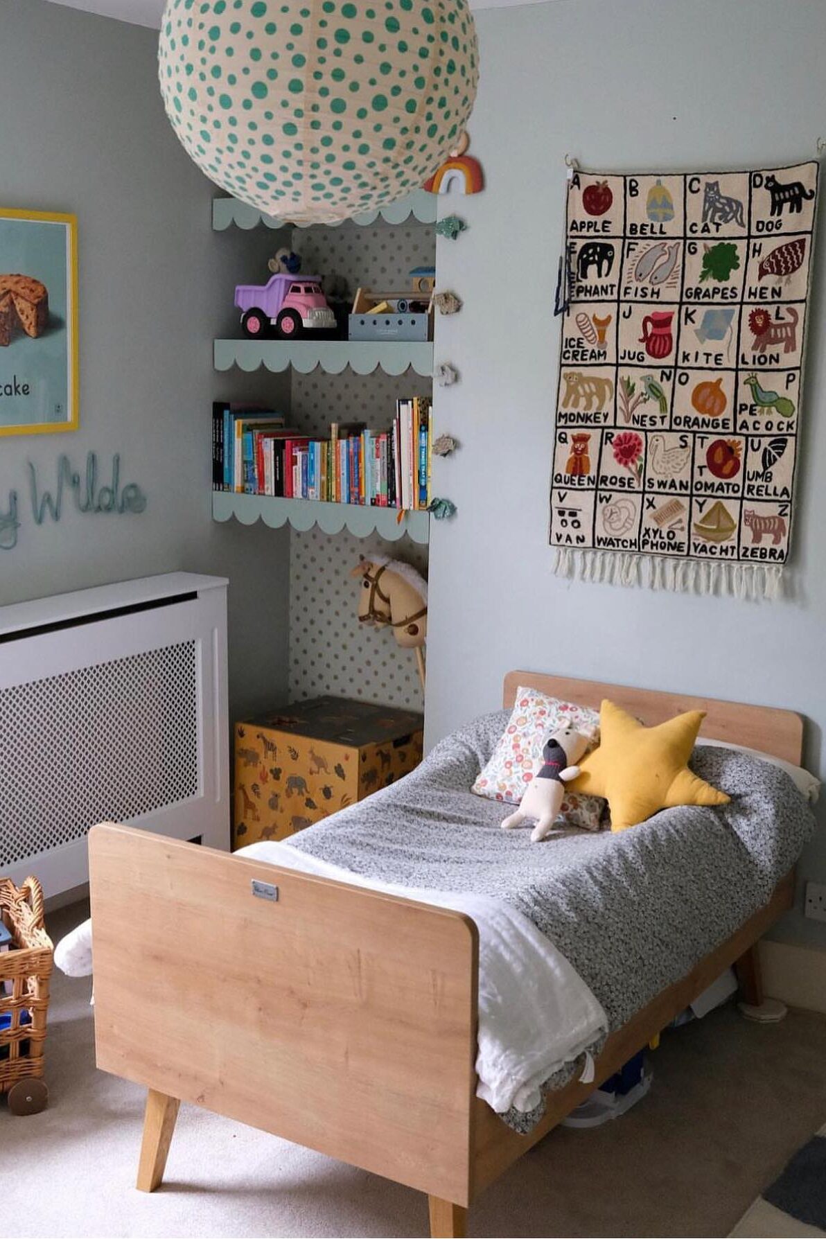
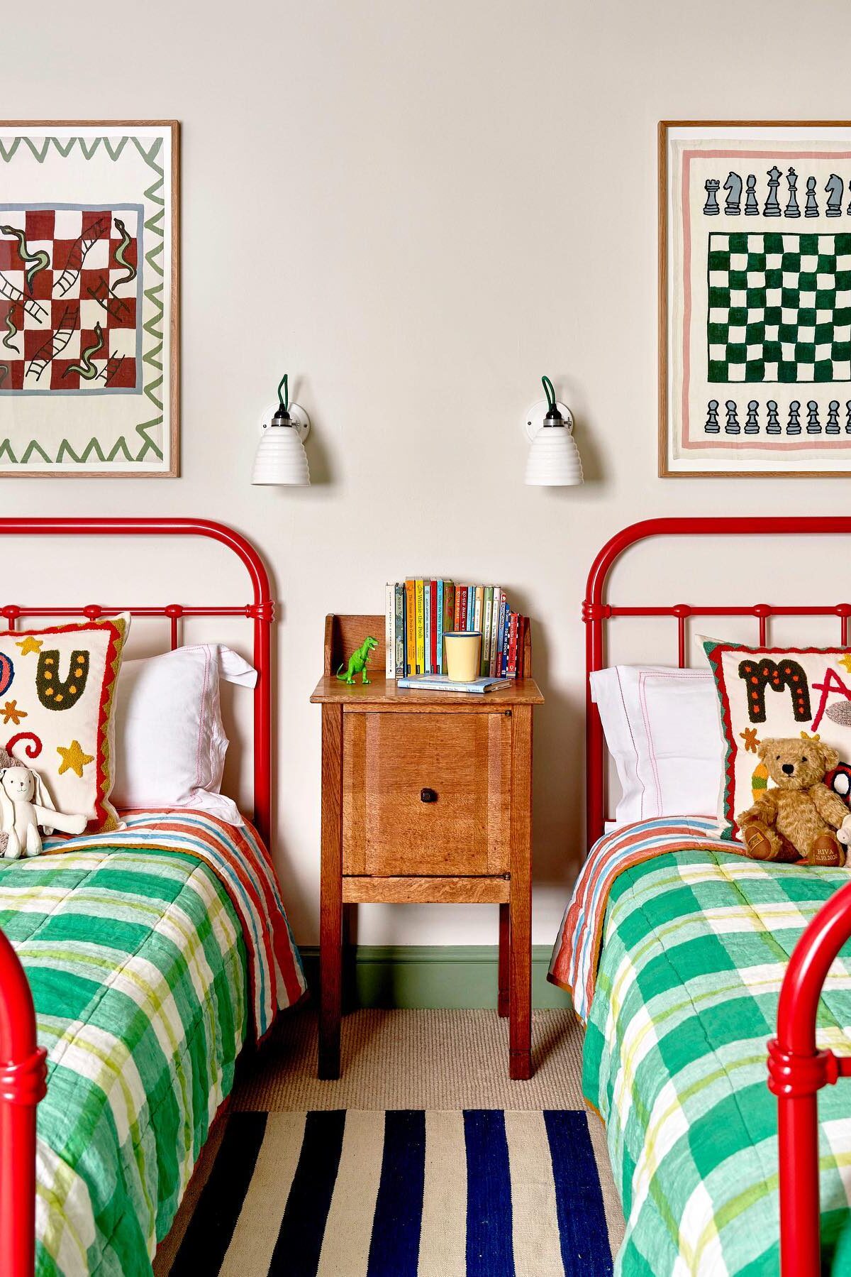
shop my kid room picks:
photo credits:
01 sarah sherman samuel// 02 emilie fourne interiors 03// emma ainscough 04// hello mini bianco 05// i spy diy 06// hermione olivia 07// katherine ormerod 08// liberty interior collections 09// matilda goad 10// rogues cottage deal 11// leah fayegaeddert 12// lonika chande
shop all my picks for kids here


[…] head here to see the rooms and spaces for the kiddos I am loving […]
[…] rooms and spaces for the kiddos […]