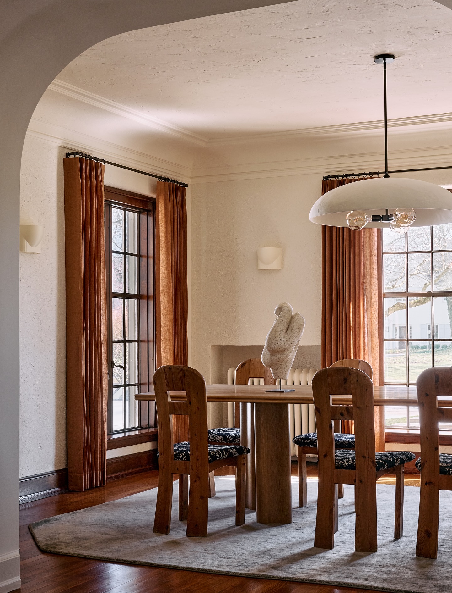
The living room in our house never really felt 100% finished. (I also realized I never shared a reveal of the space aside from featuring it in holiday decor posts or from when we babyproofed it!) We had a credenza that was a bit too small for the space, and the wall behind the sofa has been a rotation of various DIY projects and props from other projects. But finally… we have a living space that feels like us.
 To recap, we are turning our family room/playroom (which is through the open passthrough from the living room, as shown above), into the new nursery. The family room is where we had the TV and the more comfortable sofa and this living room space was more of a formal seating area. So now that this will be the main hang out area for the family we needed to make it more comfortable and much more us.
To convert the room, first on our list was to hang some sliding barn doors to be able to close off the nursery during nap times and nighttime etc. We got both the hardware and the doors from Rejuvenation. The shaker style of the doors matches our shaker kitchen cabinets perfectly which is just on the other side of the room so it was a no brainer. We installed them ourselves (you might have caught my dad and rupe literally throwing wrenches around while putting them up on my Instagram story) which went surprisingly very quick! Just the addition of the doors already made the room feel so much more finished and now I can’t imagine them not being there.

 Next up we swapped out the small credenza for a longer one that fits the space. We mounted this Ikea Besta unit to the wall to create one long one and added a piece of birch plywood to the top.
We also got the frame tv which is probably the best thing to happen to televisions and living rooms ever. The tv is mounted flat to the wall and we bought the optional wood frame, so it looks just like a piece of art instead of a giant black box. It also comes pre-loaded with beautiful art (you can also upload your own) so when it isn’t on it displays the art of your choosing. Bringing in this tv makes the transition from not having a tv in this room to the only tv room in the house not a bummer.


 Next on the list was a comfortable sofa. We don’t have a lot of space, which makes finding a comfortable sofa even more difficult. I feel like the wider and deeper a couch the more comfortable they are. So finding a petite one, that you can also snuggle up on, and is high in style was a tall order. Yet somehow magically I found it and fell in love with it and it also happened to be a great price. Urban outfitters comes out with some shockingly good furniture sometimes (like remember these green chairs from the a-frame?! they are on a roll).
We swapped out the butterfly chair for something that swivels so you can easily move from conversations on the sofa or angle it up for tv watching.
On the wall, I finally hung some art that myself and archie made (can you guess which one Archie made?) and had Framebridge print and frame. I love hanging art from friends, or artists I know, because it makes a space feel unique to you and one step even more personal is making your own art (stay tuned for my next post on how we did it!).
The last photo is some wire art that I made for Rupert and my Anniversary. We have a tradition to make our anniversary presents and to follow whatever the traditional gift is. For the 8th anniversary it is bronze so I used bronze wire to create sculptural portraits based off of photos from our wedding day. And no Rupert did not have that crazy mustache but I was married in 2009 so it was the year of the mustache photo booth props. eek.
Also, please ignore the fact that I have no mouth yet, I ran out of wire and keep forgetting to get more to finish it off. This is not intended to be anti-feminist art, I promise, haha. I pulled this portrait idea from The House That Lars built, see her tutorial here. I basically sketched out our portraits on a large piece of paper and manipulated the wire to match.
 And finally, another DIY project is the center ottoman/coffee table. When we baby proofed the house we took out a wood slat table that was top heavy with sharp corners and temporarily traded it for an inexpensive round soft one I found on Amazon. The size wasn’t ideal for the space as it is a long and skinny room but it worked for a baby friendly space. Now that we have another baby on the way and we will need a family friendly option for even more years to come, I decided to make one that is perfect for the space. I knew I wanted a simple upholstered ottoman that kids could climb on, that we can put our feet up on for extra sofa comfort, but still feels modern and isn’t of the tufted variety (surprisingly hard to find). Amber Interiors clearly saw the giant gap in the marketplace and designed the perfect gorgeous oversized coffee table/ottomans made with vintage rugs in her shop but none were the size I needed, so I used it as inspiration to make a version of my own. I didn’t use a vintage rug to keep the cost down, I used mud cloth, so it has a slightly different look, but I love how it turned out.
And now here’s a peek back down memory lane with the evolution of this space.
BEFORE

AFTER

The first photo is from before we did our renovations. Basically no corner of this house was untouched. See all the work we did, here. And the full before tour of the house here.
BEFORE

AFTER RENOVATIONS

AFTER/NOW

BEFORE THE MAKEOVER

AFTER/NOW

SOURCES:
Sliding Barn Doors from Rejuvenation // Barn Door Hardware from Rejuvenation // Wall Mounted Credenza from Ikea // The Frame TV and the coordinating wood frame // Sofa from Urban Outfitters // Swivel Lounge Chair from Perigold // Artwork by Sarah & Archie Samuel, framed by Framebridge // Ottoman is a DIY find the real deal at Shoppe Amber Interiors // Vintage Rug from The Rug Warehouse // Chandelier from Jonathan Adler
Wallpaper (peeking in from nursery) from Lulu and Georgia // Rattan Daybed (Also peeking in from nursery) from Elsie Green
Images by Sarah Sherman Samuel

I am totally with you in how hard it is to find an ottoman that is not tufted and not crazy expensive! Did you have yours made or did you do it yourself?
We made it ourselves.
Can you give even rough instructions on how you made this. I seriously keep debating making my own bc I like the idea of an ottoman over coffee table.but I need to do it rather inexpensively. So any tips for DIYWOULD BE AWESOME!
I second this! Would love instructions for the ottoman
Third on an ottoman tutorial! Sooooo cool!
Beautiful!!! Can you provide details regarding the front door? It is exactly what I am looking for!
Mine was from AAW doors and sourced locally and here are a couple similar options. https://sarahshermansamuel.com/highlow-entryway/
So beautiful! Can you please do a post on your DIY art that you sent to frame ridge?! How did you make it?
Yes it’s coming up Monday!
Amazing! Can you so a tutorial of the mud cloth ottoman?
Second! Would love your source for the mud cloth fabric to make some pillows with. It’s beautiful!
Love the room!! Also I did not see a link to those nested wooden side tables. Where are they from? Thanks!!
Oh right! I forgot. They are from zara home but unfortunately no long available.
Love! Will you be doing a DIY post for the IKEA credenza?
Love your DIY ottoman coffee table! Could you share where you got the mud cloth fabric from? Everything looks BEAUTIFUL!
What color white is on your walls? I love this! Thanks for sharing Sarah!!
Thanks! It’s snowfall by behr
Always an inspiration! Thank you for sharing!! I have to ask, what shade of white do you have on your walls? In search of the perfect white:)
It’s snow fall by behr.
Please do tutorial for ottoman! After my 3 year old busted her forehead on our coffee table we went looking for an ottoman, and there is nothing out there!
My husbands been after a new TV for aaages but TVs to me are like, meh. This one I could rally behind. Random Q – where’s the power cord??
It runs behind the drywall and plugs inside the media cabinet.
Did you buy any sort of tool or kit, or did you just drill into the drywall? Any tips are much appreciated!!
Such a beautiful transformation! I love the Selamat swivel chair. Is it comfortable enough to lounge and watch a movie?
Thank you!
Ahhh, please please tell me your sources:
1. Leather circle pillow
2. white little pouf on top of your ottoman
3. that artwork!
love!
Hi Emma! Pillow is from west elm but no longer avail. Pouf from zara home also not avail and artwork is my own!
Kind of a random question, but what wall fasteners did you use to mount the Besta unit? We actually just bought one the other day but realized the TV unit only comes with three anchors on the back and they don’t line up with our wall studs (rather than the suspension rail that comes with the regular Besta units). Would love to know if you found a good way to securely mount it! Thanks so much! 🙂
So beautiful, as always. Your mix of DIY and affordable things is so refreshing! If you have time, I second the request for a DIY on the ottoman, it’s awesome. Cheers, and all the best to you and your fam as you wait for your little one!
[…] Last week I shared the finished tour of our living room makeover, how we got it ready in time for baby and all the family that will be coming in for the holidays. If you haven’t seen it yet take a peek here and you will see this custom artwork we made for the space, which is a fancy way of saying we made it ourselves. ha But really, creating art has been my favorite thing to do since I was a wee one. I still remember when my kindergarten teacher held up a drawing I did of a dinosaur to show the class and I’m not sure I have been prouder of anything since. Of course a lot of the work I do for a living is creative, and is some form of art, but freely drawing and trying new mediums just for the sake of fun can sometimes slip through the cracks but I am ALWAYS so happy when I do get a chance to. […]
With the besta credenza- did you pick the doors and plywood from ikea as well or are those from other sources? Your style is our favorite so thanks for sharing!
i would also be very interested in seeing a DIY tutorial on the ottoman!
[…] of things, this room doesn’t have any venting to our HVAC system so now that we installed the sliding barn doors we needed a way to adjust the temperature easily. Also being a baby’s room we wanted an air […]
Such a great transformation! I really love the chandelier! very elegant and stylish.
Love the sketches…happy sketching!
I’m curious as to what size you made your ottoman?
I’m thinking of making one 22x32x26 and was curious as to how it compared to the size of yours pictured.
Thanks!
Hi. Love the wire art – what kind of wire/size did you use?
Hi. I´m in love with the hexagon mirror in your hallway! Where did you buy it?
I love love the rug!! Where can I get the same rug and the grey sofa?
Such a great conversion! I really love it
Hi Sarah,
I love your style! Do you mind sharing the source of the doors and birch plywood that you mixed with the Besta furniture from Ikea?