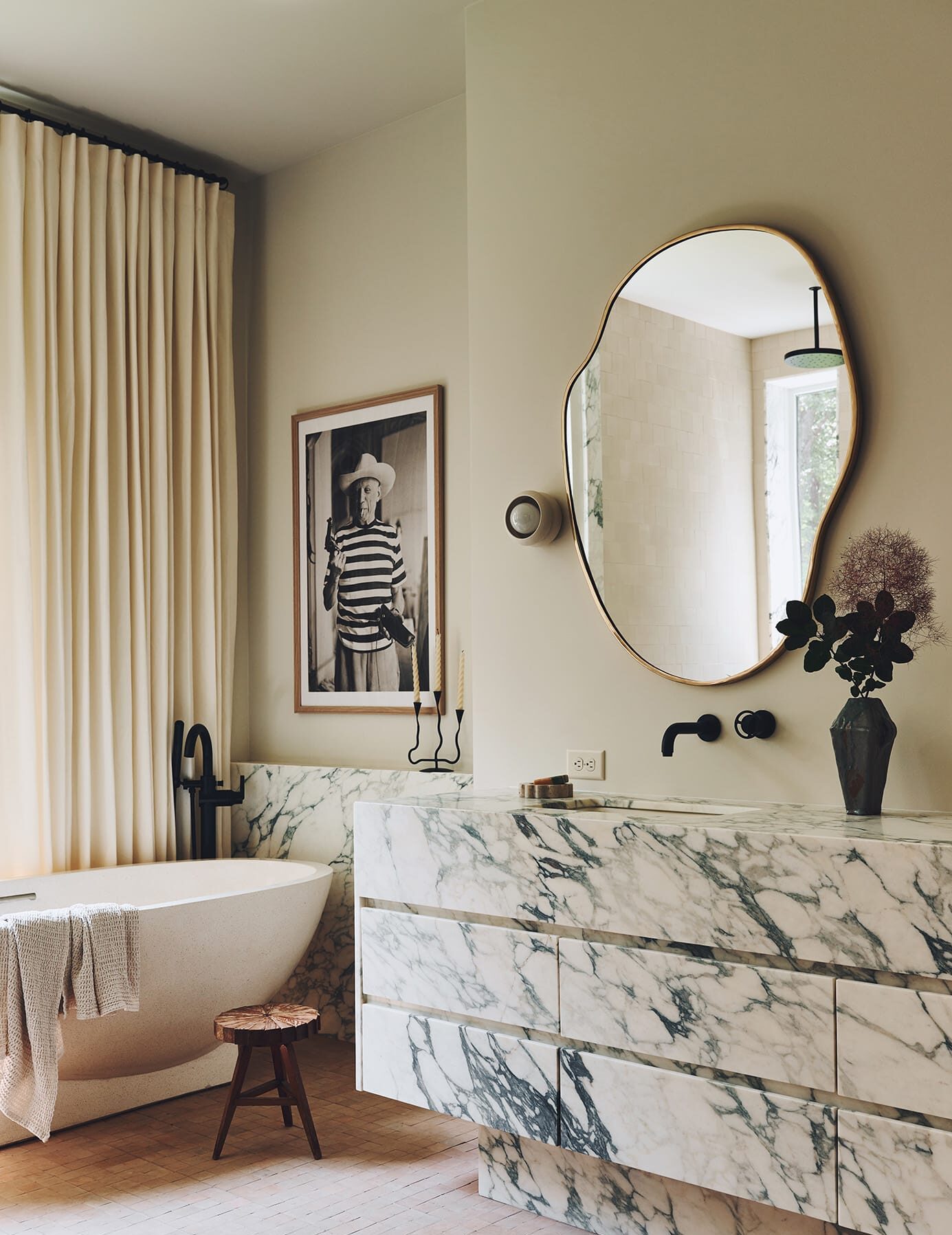
It may seem I am bathroom crazy over here at the moment but we have three more bathrooms to talk about on the Trullbrook project and this one is hands down my favorite! The master bath. It has a neutral color palette but is far from boring with special touches and every detail considered. But before we get to the design… here’s the before photos (a special mention to the dark brown carpeting because you know I love a carpeted bathroom. ew).


 You might be wondering how all these different angles could possibly be in one bathroom and the answer is, it is actually three different tiny little rooms that make up one full bathroom. The result is a lot of wasted space, a weird flow and confined quarters that feel more like a powder room than a master bath. Here is the current floorplan to give you a better idea of what we were looking at when they first purchased the home.
 And the plan…
 By tearing out a lot of walls, moving everything around, and adding some large windows we were able to create a spacious master worthy of its’ name.
My biggest struggle with this space was the one thing the homeowner said was a must have and that was a giant drop-in oval tub. When I think of a built-in oval tub, the 80’s immediately come to mind. We joked that she was going to have a swan faucet to match, but the girl likes her baths and no matter how hard I tried to convince her to get a freestanding, she wasn’t having it. And I get it, the heart wants what the heart wants and who am I to try and deprive someone of something they feel so passionate about? So off I was to design around it and make sure the space looks like this decade and not too Dynasty. But really, as far as drop-in oval tubs go, it is actually a great one with clean lines and, so far, it is all shaping up very nicely.
THE INSPIRATION


And a couple other inspiration bathrooms that were on her board that I loved…
Top bathroom by Tamaraa Magel // Second bathroom by Maggie Pierson
A soft palette, round shapes, simple tile in interesting patterns, some sort of terra cotta, gold fixtures, storage in the vanity, a built-in makeup vanity and a unique marble slab were a few other items on the want list that I was definitely on board with. And here is a peek into the selects for the finishes.

Once we landed on the floor and wall tile it was time to go slab shopping. We found quite a few contenders but landed on the gorgeous warm taupey colored vein marble. Quick tip when you are slab shopping…

Next up was designing a custom nearly 9 foot vanity to go with the slab.

And finally here is a rough idea of how it will all come together.

See all the posts on the Trullbrook Residence here.


That taupe-y marble is beyond gorgeous!! I can’t wait to see it all come together.
LOVE the materials going into this reno, especially the x + o tile! Something for the homeowners to consider (if it’s not too late) would be having the doorway to the closet be a pocket door entering from the bathroom… That way they don’t have to leave the bathroom post shower/soak to get dressed. It’s something we would do differently in our next space.
It will be fabulous, regardless! Looking forward to seeing the finished product!
Your shoes look comfy, where are they from.😊
[…] know we love a good makeover! This bathroom, designed by Sarah Sherman Samuel, had such a beautiful […]
What’s your kohler gold color choice now that it seems they’re not making French gold?
What’s your gold color of choice now that Kohler seems to not be making french gold? The brushed bronze seems almost silver in some photos, but the brushed gold almost orangey?
I Knowwwww! I miss frnech gold. In the trullbrook house we actually ended up not going with Kohler but in our a frame I picked the brushed bronze it is a little more gold in real life than it looks in photos but we will see once they are installed! I don’t love how orangey the gold gold is. Hope that helps. X
Hi! I am just wondering what programs you use for your digital design boards and for your 2d floor plans and elevations? I have tried a few but haven’t found one that I love working in!
THANKS!
My background being graphic design has me defaulting to adobe illustrator and photoshop. x
What program did you use for the last computer rendering? Looks dreamy👌🏻
That’s just photoshop!
[…] finished master bathroom from my “Trullbrook Residence” client. You may remember the before photos and the design plan from this post, and it is all coming together. The custom vanity I designed, the basket weave tile pattern, the […]
Hi! Inspired by this basketweave pattern! So fresh and unique! Can I ask how you finished the corners and edges? Did you use a trim tile? Or a schluter? Thanks!
Love the bathroom “XO” floor. What color grout did you use with this tile.
thanks so much!
Sharron
[…] with carpet removal we had to bust out about 27 walls (ok more like 5 but close enough). See the design plans here to see how we reconfigured the entire space to give Jaimi and Matt their dream […]
Hi! In the middle of a renovation and would love your basket weave tile link. Thanks!
I too, love this bathroom!! Same question as above, for the “XO” floor tiles & basket weave pattern tiles, can you please share details on the grout & color used? Thank you! Minette
love to see the finished bathroom